Core web vitals are key at every stage of a B2B website project

I want my site to be #1 in the search results
A request that we hear often.
At one point the task of improving rankings sat firmly with the SEO and content teams but times have changed and rightly so. As algorithms evolve, so do search rankings, extending to include a wider range of metrics that cover not just content relevancy but also UX, design and structure.
Factors that influence ranking, now touch all points of a website project. From planning and discovery through to design, build and deployment.
What are Core Web Vitals?
Soft launched last year, Core Web Vitals are a set of 3 page experience signals being officially rolled out by Google in May 2021. They are:

LCP – Largest Contentful Paint
Focuses on a website’s load performance and in particular the time it takes for the largest image or text block above the fold to fully render. This tends to be the easiest to improve via quick wins such as image optimisation. You can read more about it from our Senior Front End Developer, Andrew here.
FID – First Input Delay
Simply put, this metric covers interactions such as call to action buttons, links or any bit of a site that a user would click or tap on.
CLS – Cumulative Layout Shift
This looks at visual stability and will give a lower score if the layout is jumping around as a page loads making it difficult for a user to interact with, you can learn more about it from Andrew here.
The user is king
Core Web Vitals provide a user experience layer of metrics on top of the existing search ranking factors. This means that alongside the bedrock signal of relevance, sites are now also marked on a user’s experience when they visit the site.
After all, a user simply wants to visit and complete their task as quickly as possible before leaving the site and getting on with the rest of their day.
Therefore they want and expect fast loading pages with links and buttons that respond quickly on interaction and stay where they are without leaping about all over the place when they try and tap/click them.
Sounds like common sense stuff, right?
However, with so many people involved in the development of a website – from brand marketing to procurement, content editors to IT (not to mention designers, account managers, digital marketing and developers) – and so many stages and feedback loops, there are lots of opportunities for risks to creep in.
These risks might seem small or insignificant to begin with but over time can have a real and noticeable effect on your search ranking – not a result any business wants.
That’s not to downgrade or say your written content is any less important – far from it. Relevance will always be a top ranking feature. It’s just that alongside this, other usability factors will have an impact, with the result that some sites will move up the rankings while other sites will slide down them.
I don’t want to be one of the sites that slides down though!
Who does! Luckily, there are simple steps that can be taken to manage this.
The main one being: do not lose sight of the user.
Most people will agree that whether you’re searching for a new pair of Vans high tops or looking to contact the BT support desk, there is nothing more annoying than trying to click on a link or button only for it to jump about as the ad placements fire up and the images load.
Not losing touch with how the end customer/user will engage with the site is at the crux of it. That’s why all members of the team on both the client and agency side need to be keeping this in mind at all points during a web build, asking the key question:
Will this feature help or annoy a user?
How to ensure that CWV are considered at each stage of a B2B website project?
Planning and discovery phase
During a project discovery phase, a key focus is of course identifying exactly who the priority users are. Afterall, these are the customers/clients that will deliver the most value to your business and drive revenue.

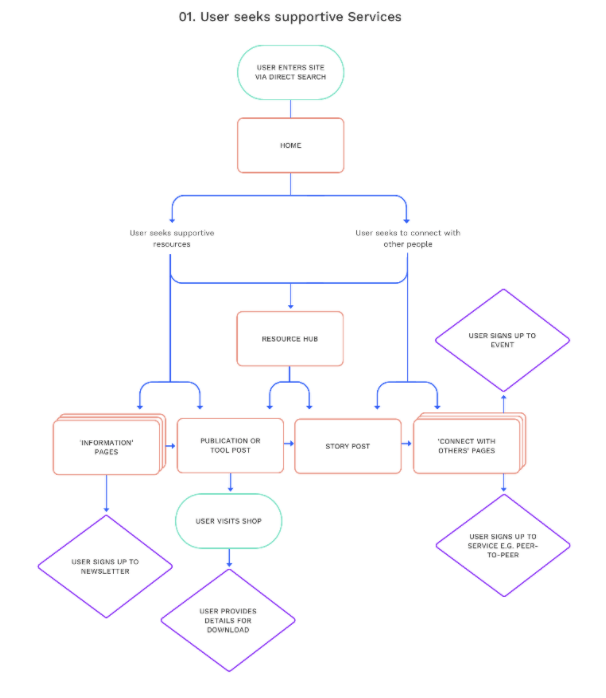
Without getting too into the nitty gritty, once the priority personas for the website are known, we start to build out user flows, the sitemap as well as looking at key search terms and content mapping.
Alongside content mapping comes the wireframing and this is where the site begins to take shape and become a little more visual, even if it is only simple line sketches of how content will be structured on a page.
This is a good point to sense check and think longer term about Core Web Vitals. For example, are there content types that could follow a scalable and set template style to aid consistency such as blogs/thought leadership articles?
WIll there be images/media included and are they optimised?
Is it really necessary to have all those multiple blocks and elements on a page? They may seem important because a key team member wants to include them BUT are they essential and will they add value from a user’s point of view? it’s always good to take a step back and ask:
Will this get in the way of how a user will engage with the content?
If the answer is yes, perhaps they shouldn’t be included
Design phase
This is usually the phase that everyone’s been waiting for.
It’s where the site really starts coming to life as the company’s brand, style and colour is introduced and applied to, what has up until now, been mainly in black and white (post-its aside) – on flipcharts, spreadsheets and cold line drawn wireframes.
It’s also the point where strong opinions come into play about the styling, transitions, imagery, animations and cool effects that need to be included. Everyone has a preference or a comment to add when it comes to design.
This is a risky phase as it’s likely that usability and accessibility considerations like simplicity, space and consistency can be compromised.
Therefore, it’s another good time to take a step back and ask….
Will it get in the way of how a user will engage with the content?
Again, so long as the user is placed front and centre at every project stage these risks can be minimised.
Development phase
Andrew talks about these elements and pitfalls in greater detail in this post on LCP and this one on CLS, but it’s worth mentioning a few points to consider as a project moves out from the design phase and into development and deployment.
Scripts
Tracking tools, forms, CRM and plugins will inevitably be key integrations required as part of any B2B website but these too can have an impact on performance. Especially site speed and load due to the number of tracking scripts and API calls that may be required to run in the background.
Integration may be a technical consideration that few want to spend too much time talking about (“that’s a dev’s job right?”) but, they do and will influence a site’s performance. So, the sooner these points are raised in a project, the better.
No one wants a site with all the latest bells and whistles only to find that site performance and signals might be impacted as a result once the site goes live.
If these are identified and discussed early at Discovery phase, then there is the opportunity to discuss what is “essential and business critical” against what is a “nice to have”.
If they are a “nice to have”, could they be left out to streamline the site? If they are essential then it is important to keep these in – we can always investigate ways to try and mitigate any possible negative effects on SEO.

GDPR and cookie policies
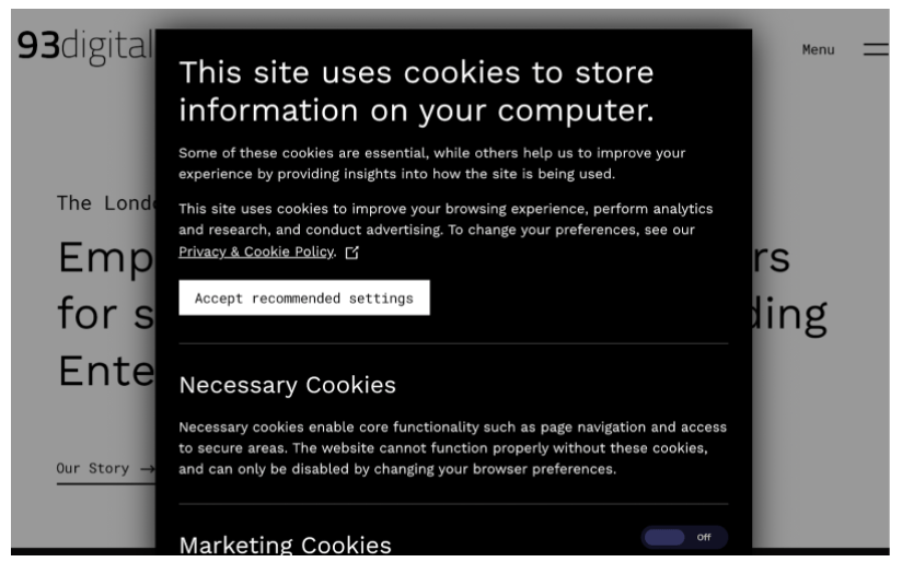
Although an essential requirement on any (European) site, cookie pop ups and disclaimers can, do and will have some impact on a site’s CWV scores.
By their very nature, cookie/compliance notices are meant to be obvious and noticeable but this can go against the scores. They are however an absolute ‘must have’ so care needs to be taken to ensure any effect can be minimised while ensuring legal requirements are maintained.
Another element to consider is the use of ad trafficking software and ad placements.
Obtrusive ad placements and pop ups that mask a feature or cause the layout to shift as images are loaded will impact your scores. Simply put, if they prevent a user interacting with the site then rankings will be impacted.
The real world
A website represents the whole of a business and so a project will involve multiple stakeholders and interests.
From different business units, functions and teams – each will have their own needs, wants and opinions. It’s therefore inevitable that some will conflict with each other and it’s inevitable that some requests will have a bearing on rankings.
A key take out is that it’s unlikely you will get an absolute perfect score on every measure. That’s not to say you shouldnt aim for the perfect but it is a fact that trade offs and compromises will be needed along the way.
There will always be a balance to be struck between the design, functionality and performance metrics.
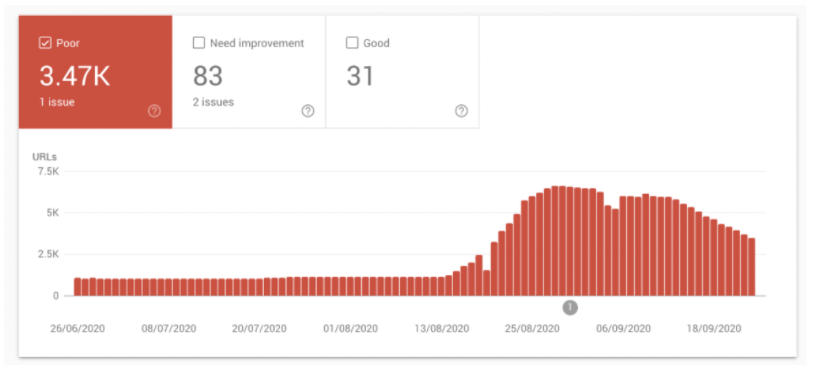
By way of example, the graph below shows a search console snapshot of a publishing site launched last year around the time the beta version of Core Web Vitals was being soft-launched. The image looks very dramatic – “3.5k URLs with a poor rank!”
However, digging a little deeper the issue was a common and easy one to address and improve.
It centered on a number of large images that had been uploaded in a number of news articles and the algorithm had picked these up and assumed that if one article had this issue then it was likely that all articles (with that template) would also have that issue. This was then applied across the scores. The signals were corrected and adjusted over time but it highlights a risk that could happen, particularly on large sites with lots of similar content and lots of editors.
The takeout here is to ensure consistency not just of templates during the build but also consistency in the instructions given to content editors and admins so they are aware of the dos and donts. This will help minimise the risk of non optimised content such as video/images and additional blocks being introduced post launch which could impact scores.

A key element of project management is to facilitate but at the same time remind all stakeholders, whether they be client or agency side, at each step in the process that the priority is always the user.
Customers are the ones that deliver the revenue – not the transition effect or animation.
If you want a site that delivers against business targets as well as rankings, then you need a site that is simple to navigate, easy to interact with and of course delivers to a user what they were searching for as quickly and as painlessly as possible.
Pretty much what Core Web Vitals is looking to help them do.
Ultimately, it’s a balance between company needs and user needs.
The user is king.

How we integrated Salesforce with WordPress for ILPA

The in’s and out’s of a website support retainer
Let's Talk
Do you have a web design and build project coming up that you would like to talk about?