5 Great Examples of B2B FinTech Website Designs

With the B2B financial technology industry growing rapidly — reaching an anticipated market value of over £220 billion by 2025 — a great website is essential for standing out from the crowd. B2B FinTech customers have a slate of options available to them, so it’s important to communicate value quickly and visually. We’ve collected five examples of great B2B FinTech website designs to give you inspiration for your next site launch.
Key elements of good B2B FinTech website design
Great B2B FinTech websites share several common best practices and features, including:
- Value proposition: B2B FinTech startups need to emphasise exactly how they provide value to their clients — and their clients’ customers in turn. The best B2B FinTech websites state this value proposition clearly and in simple language that’s easy to understand.
- Interactive tools and calculators: If your company’s primary value proposition involves increased interest rates or reduced fees, it can be more impactful to show this through a calculator tool, rather than simply say it.
- Clear navigation: On a great B2B FinTech website, there’s little question about where to go for more information. Whether a visitor is seeking more information about a use case, interested in pricing, or ready to sign up, they can find what they need quickly and easily.
- Multimedia: Usability is important in B2B FinTech. Showing images of the product and its available integrations helps to immediately reassure visitors that your service will be easy to use and fit with their tech stack.
- Social proof: Case studies, testimonials from users and logos of client partners are useful for building trust and credibility with new audiences.
- Regulatory notices: Businesses operating in the financial services sector may have to provide specific regulatory disclaimers by country or region. Many B2B financial institutions put these disclaimers in site footers and create a different home page for each region they serve.
As with any B2B site, it’s also important to have a clear CTA. Whether you’d like your B2B FinTech website visitors to sign up for a demo or jump right into using the product, this should be clear in the call to action.
Examples of great B2B FinTech websites
The following sites are just a few examples of great website design found throughout the B2B FinTech community.
1. Wise (formerly TransferWise)
Wise facilitates global payments in multiple currencies. It is available in many countries around the world and actively promotes its low fees as its main value proposition.
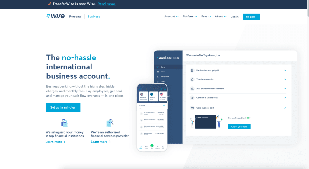
The Wise website features a calculator near the top, so business owners can see exactly how much they’ll save in foreign transaction and processing fees:
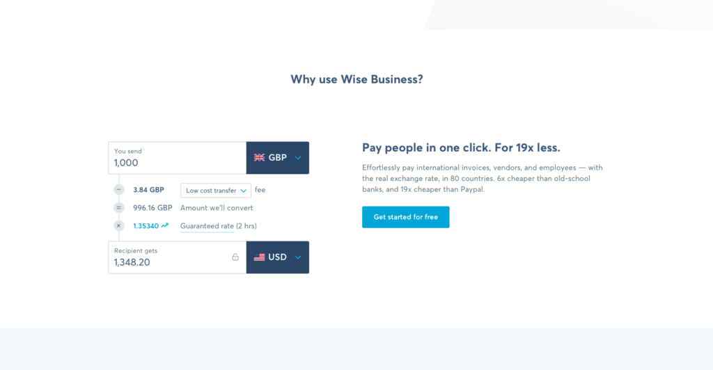
Users can customise the calculator with any of Wise’s 26 supported currencies and three types of transfers.
The homepage also calls out other Wise features that are sure to be familiar to business owners, including:
- Bank account reconciliation
- Invoicing
- Batch payments
- Collaboration tools
These additional features are paired with product illustrations to give visitors a sense of how the product will function after they register.
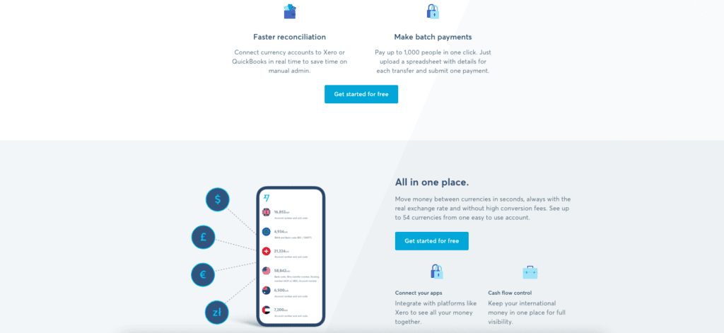
The final features list also changes based on a visitor’s location, and Wise places any relevant financial regulatory notices in the footer of its country-specific landing pages.
2. Kabbage
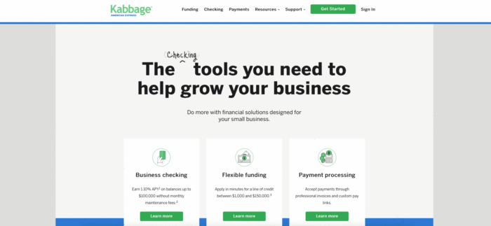
Kabbage provides qualified loans to businesses in the United States. The company utilises a rotating header that lists multiple use cases, so visitors get a sense of the product features as soon as they land on the page:
Kabbage is part of the American Express family of companies and clearly leverages this brand association up front to build trust:
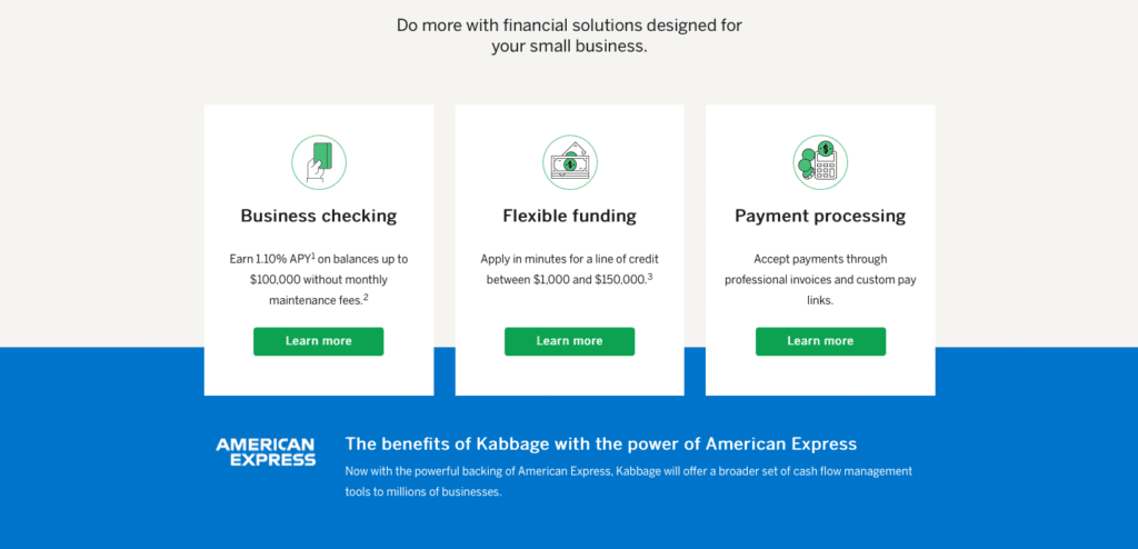
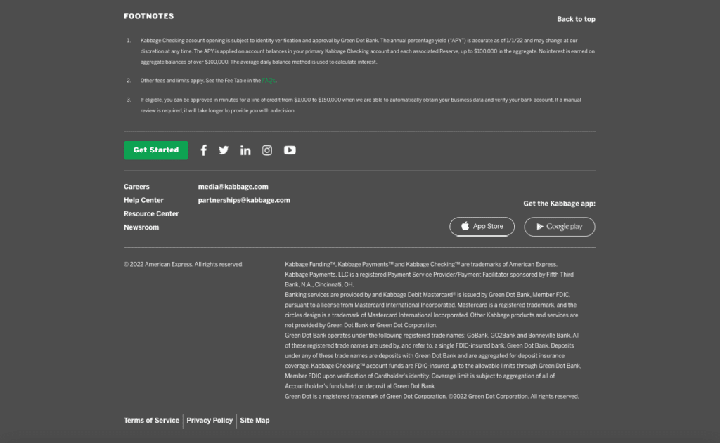
Because Kabbage does not have its own bank charter — a requirement to provide certain financial services in the U.S. — they partner with a variety of other financial companies to provide specific banking services. These companies receive mention in the site footer to comply with regulatory requirements:
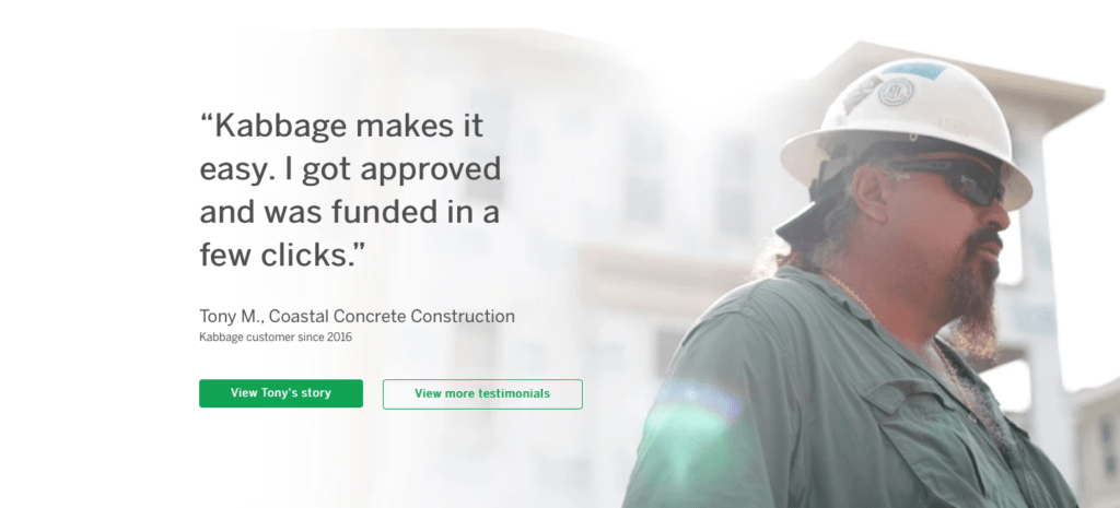
The rest of Kabbage’s homepage focuses on highlighting its core features in simple, straightforward language. The company also utilises social proof to create a connection with its core audience of small business owners:
3. Paystand
Paystand leverages blockchain technology and Ethereum cryptocurrency to create secure and verified B2B payments.
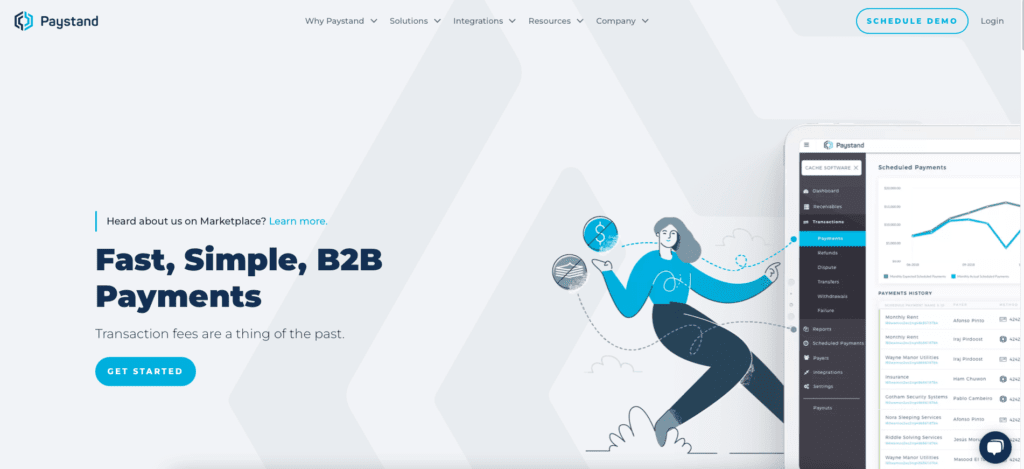
As the concept of B2B blockchain may be new to many visitors, the company utilises trust-building client logos and social proof in several places throughout the homepage.

Rather than giving into the complexities of blockchain on the homepage, Paystand positions itself as a straightforward and affordable alternative to other B2B payments services. Listed features are all familiar to enterprise buyers, including:
- B2B payment processing
- Automated billing
- Enterprise resource planning (ERP) software integrations
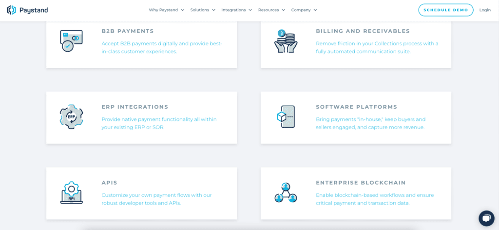
Paystand provides further information about its blockchain technologies through header, footer, and inline links. This structure keeps the initial landing page experience clean and simple to understand, while providing more technical information as potential customers move through the sales funnel.
4. Swipe
Swipe is a payment processing platform for small to medium size business owners and entrepreneurs in India. Like Kabbage, Swipe utilises a dynamic header to highlight each of its use cases up front:
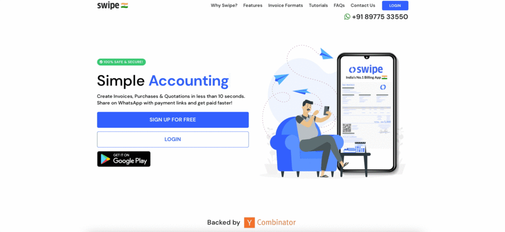
The product’s connection to WhatsApp gets highlighted several times throughout the site, and serves as a key value proposition for its intended audience. India is WhatsApp’s largest user base, with over 390 million residents using the chat app every month.
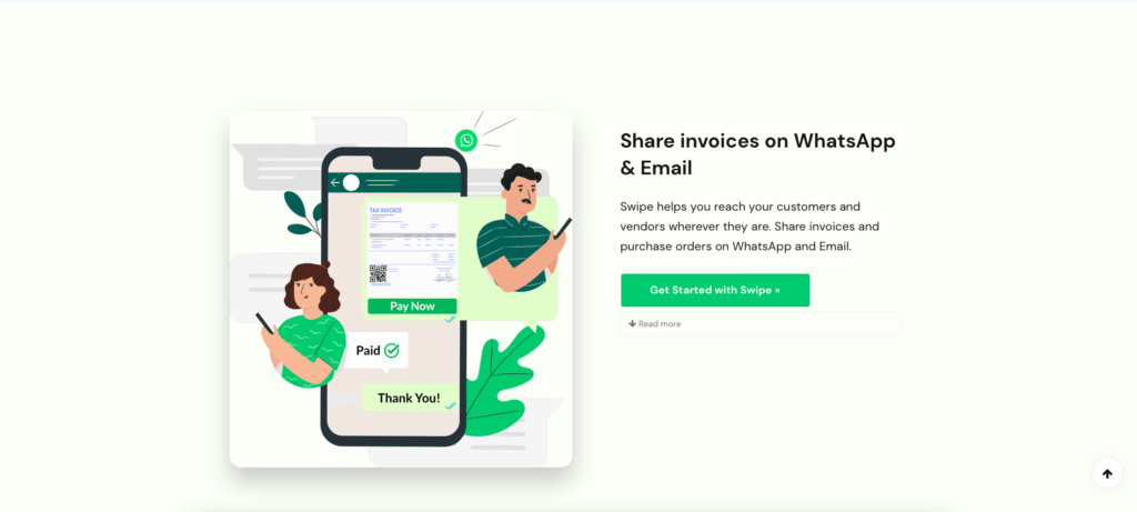
Swipe displays clear images of its invoice templates and receipts, illustrating how the product can suit retailers, service providers, and online merchants.
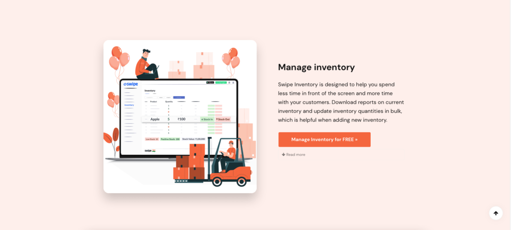
The company also utilises bold graphics and colourful buttons to clearly differentiate each of its capabilities, including:
- Goods and Services Tax (GST) reports
- Inventory management
- Mobile payments
- E-commerce checkout
- Business analytics tools
- Rapid invoicing
- Point-of-sale (POS) credit card processing
5. Brick
Based in Indonesia, Brick is a financial API platform that provides services to other B2B FinTech companies in Southeast Asia.
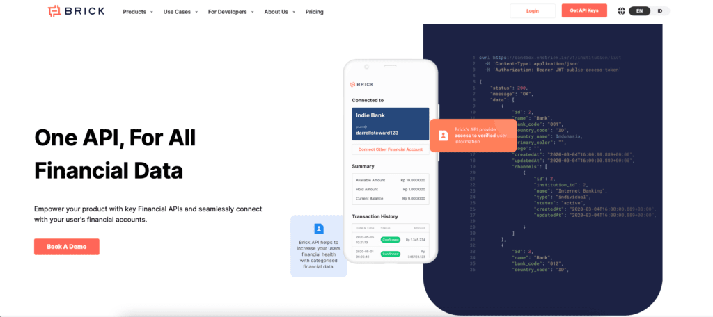
The tool enables a variety of actions including:
- Digital banking account and transaction data access
- Employment data access
- Identity and account verification
- Disbursement of funds
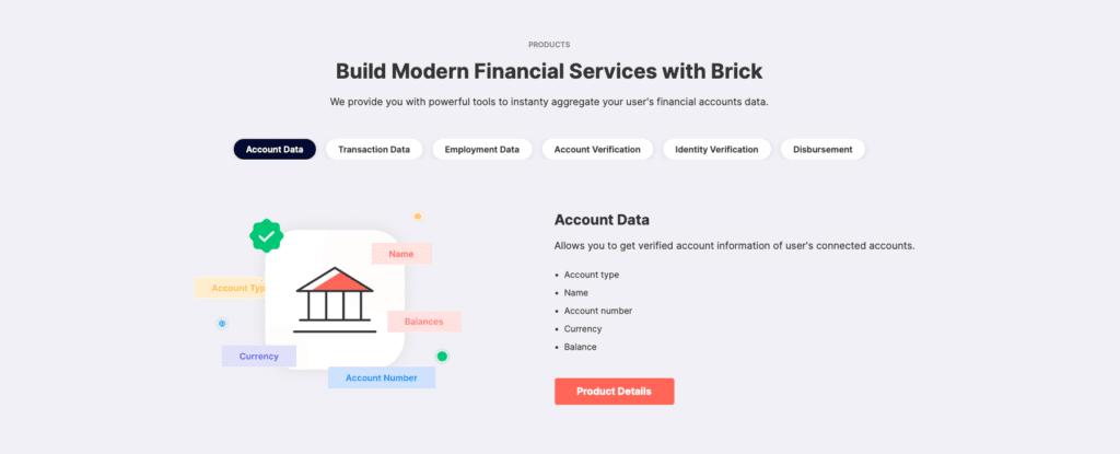
Each potential use case is succinctly outlined with clear visuals:
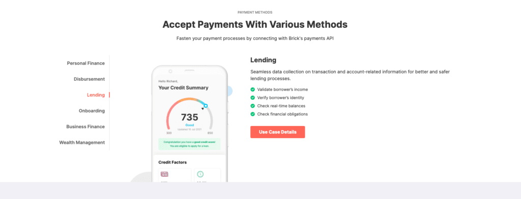
Because Brick’s core customer base is already working in and familiar with the FinTech world, the homepage content is a bit more technical than on the other examples listed above. If a user is seeking out the Brick platform, it’s likely that they already understand how and when to use a FinTech API.
Brick incorporates a variety of testimonials from FinTech clients as social proof, and allows visitors to either book a demo or jump right into working with the API.
How to build a great B2B FinTech website
When building a B2B FinTech website it’s important to keep security, flexibility, and scalability in mind. You don’t want to find yourself locked into a platform that can’t grow with your business or provide the feature sets your customers require.
Open source websites are preferred for B2B FinTech use, as you maintain great control over the design and functionality. Your company completely owns its website pages and content when you opt for an open source platform. It’s very easy to integrate essential B2B tools into an open source site as well.
At ClarityDX, WordPress is our platform of choice for B2B FinTech industry websites. There are over 59,447 available plugins to integrate a WordPress site with business tools, and the open source platform allows users to develop any app or functionality they’d like. WordPress sites are a blank slate out of the box, so your B2B FinTech site can look and feel any way you’d like — just look at the Open Banking site as an example.
If you’re in need of a B2B FinTech website that resonates with your audience, get in touch to learn more about ClarityDX’s services.

Common myths about B2B website projects: debunked

What is it like working at a B2B website agency?
Let's Talk
Do you have a web design and build project coming up that you would like to talk about?
