The goals of a B2B website

So you need to build or redesign a new B2B website, but where do you start? Even more importantly, how do you ensure that your B2B website design is effective?
With careful planning and execution, your B2B website can help take your business to the next level, by providing a digital first experience for your B2B buyers, boosting your SEO and showcasing your brand. In this article, we’ll discuss common goals of a B2B website, and how to accomplish your B2B website goals, so that your business can reap the full benefits of digital marketing and B2B website design.
What should your B2B website goals be?
Your B2B website goals will vary depending on the nature of your business, but it’s safe to say that most companies have the following objectives in common when crafting a B2B website design and building it.
To educate your B2B website users
In order to help your buyers understand what your business does, it’s imperative to understand them first. You should have a sound idea of your customers’ interests, behaviours, preferences, and experiences as they make their way through your site.
A good B2B website design takes each of these factors into account in order to determine the most effective method to educate the buyer. A common but useful example of customer education on a B2B website is an explainer video on the homepage; a tactic that is especially helpful if your product or service is complex and involves technical concepts or language.
To generate B2B leads and convert them to customers
Of course, one of the main objectives of any business is to attract and retain customers, but some businesses underestimate how much of a key role a website plays in that goal, especially in a digital marketplace. B2B buyers are increasingly using digital methods to search for new solutions, products and services that can solve their challenges. Therefore, having an optimised B2B website design is increasingly becoming a must-have, rather than a nice-to-have.
There are many ways you can optimise your B2B website for leads and conversions. The easiest of these is to ensure your visitors know, as soon as they arrive on your B2B website, how you can help make their lives easier and their businesses more successful. If you can answer their most burning questions within the first few moments of them landing on your website, you’ll not only reduce your bounce rates, you’ll increase your likelihood of gaining high-quality customers.
To build credibility and authority for your B2B brand
Before they buy, potential customers want to know that you’re an expert in your field and that you can be trusted to provide the best solutions for their business. Your website should showcase your company’s expertise by not only highlighting all the ways in which you can help businesses grow, but the ways in which you’re qualified to do so.
There are a number of ways to showcase your previous success —one of the most obvious is through customer testimonials, however, you also shouldn’t discount the effectiveness of a company blog. Including a blog into your B2B website design can be an excellent opportunity to prove your industry knowledge while educating your customers about your business.
To provide insight about customers
One of the key goals of a B2B website should be to give you more data about the audience you serve in order to further meet their needs. This could include insight on customer demographics, buying behaviour, and motivations, all of which will help your company better understand who its customers are and what they want.
Additionally, these insights can help you with developing targeted marketing campaigns that you can use for other marketing avenues, such as email marketing or social media. To develop a sound profile of your average buyer, it’s important that you regularly analyse the users and their behaviour on your B2B website.
Take note of which pages visitors are spending the most time on, which of your form fills is converting most, or which pieces of content are resulting in high bounce rates. From there, you’ll be able to deduce how you can make improvements.
How can you accomplish your B2B website goals?
Now that you understand some of the main goals of a B2B website, here are some of the best B2B website practices to help you as you start building your new site.
Determine your business goals
It’s important to establish both your short and long term business objectives before starting your B2B website design. Without specific business goals, it can be difficult to make decisions about what content and features to include on your website, but once you know what you want your website to achieve, you can start to create a blueprint that will help you get there.
In doing so, be sure to keep in mind who your target audience is and what you want them to do when they visit your site. You may want them to learn more about your products or services, or you may want them to contact you for a consultation. Whatever your goals may be, make sure they are clearly defined and easily measurable.
Be specific
When it comes to your B2B website, you need to make it clear to your audience what your company is all about. Many B2B website designs, such as Asana.com, for example, introduce themselves to visitors on their homepage, typically by using a tagline or catchy phrase that summarises what their business does in a nutshell.
This heading is usually followed by a short paragraph expanding on the headline and then some sort of call-to-action button. By using this model, Asana has given visitors a solid idea of what their business offers within mere seconds of landing on the homepage.
Put user experience first
As tempting as it is to get caught up with the possibilities of flashy designs, animations, and pages, you should always try to prioritise practicality and quality. Start by asking yourself, “what do I want the buyer journey to look like?”.
Do you want them to read a short paragraph about what your business offers and then fill out a contact form? Do you want them to watch a demo video and then sign up for a free trial? Do you want to offer a nice discount and direct them straight to the buying stage? Determine which goal and process will be most useful for your B2B business model and then work it into your website structure.
Take feedback into account
Have any of your customers told you specifically that an aspect of your website needs work? Even if they haven’t, there are still ways in which you can gain this information. For example, if you notice you’re having to answer the same questions over and over again when your buyers contact you directly, it may be a good idea to create an FAQ page.
You can even glean some useful insight from your own employees, particularly your sales team who have talked one on one with prospects and have heard about their challenges and queries directly.
Furthermore, new chatbot technology and search tools can automate this process, and you could consider implementing an appointment setting software into your website design. These tools would free up your employee’s time so that they can focus on nurturing warm leads who have indicated a strong intent to buy.
Create and use a style guide
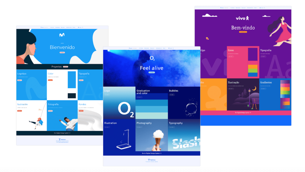
A style guide is a document that outlines the specific style rules for all written and visual content used for your marketing materials, including your website. This guide can consist of logos, fonts, colours, headings, images, and any other brand standards you deem necessary to ensure a consistent look and feel across your entire website.
When creating your style guide, be sure to include instructions on how to use your brand’s logo and fonts. You’ll also want to decide on a primary colour palette and use it throughout your website. Images should be high-quality and consistent in style, and all text should be properly formatted and edited. You can easily put together a custom style guide in a PowerPoint or Google Slides presentation that your employees can access, or you can use a style guide tool like Frontify.

Use responsive design
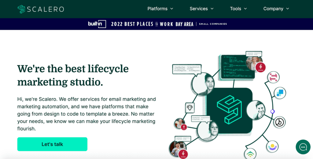
A responsive design should be a top priority for any B2B website. With such a wide range of devices and screen sizes being used to access the internet these days, it’s important that your website looks great and functions flawlessly no matter what device it’s being viewed on. This helps your business come across as more professional and makes it easier for your visitors to navigate your B2B website.
Take a look at this example from scalero.io.

B2B Website Design Examples
For inspiration, check out ClarityDX’s case studies, to see how we design and build exciting websites for B2B companies.
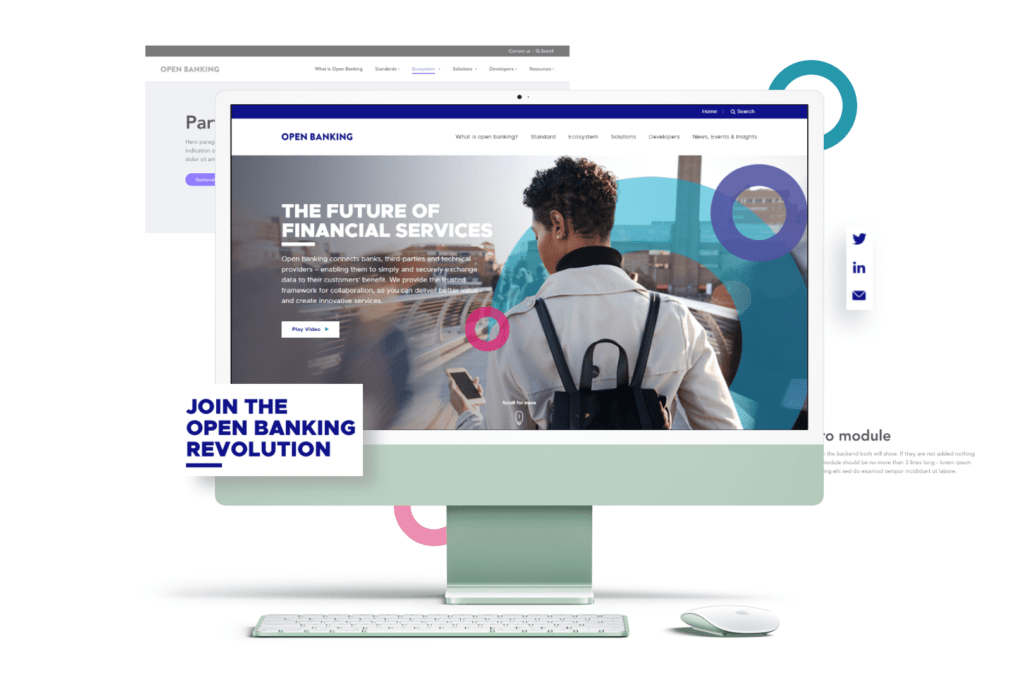
Such as Open Banking, a B2B FinTech company. ClarityDX led the discovery, UX, design & build of a best in class B2B digital experience and content platform that sits at the heart of their digital marketing & communications.

A website is one of the most important tools in any business’s arsenal, but it’s especially important for B2B companies to establish trust and build long-lasting relationships with their buyers. By taking the time to plan and optimise your website according to your business’s needs and goals, you can help your website reach its full potential.

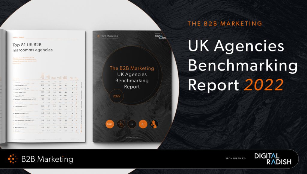
We’re officially one of the UK’s top ‘Rising Star’ agencies!

Internal Day: March 2022
Let's Talk
Do you have a web design and build project coming up that you would like to talk about?