Why vision defines the world’s best websites

At ClarityDX, we give fearless consultancy across our MarComms services, enabling our clients to deliver on their goals to accelerate positive impact and change. The brand’s website is crucial to these aims, and when this tool is used effectively it should present the heart of the business: what a company is about, its core ambitions, and how it plans to achieve its goals.
In this article, ClarityDX’s Partner – Digital Marketing, Graham Beedie, explains how focus around a brand’s purpose and vision is the secret ingredient behind the execution of the world’s best websites. Graham will talk through how these elements should be incorporated into the website discovery phase, and how holding onto vision throughout development is integral to creating a site that resonates with stakeholders and leads to higher engagement and conversion.
Too many cooks
Companies are made up of many moving parts and stakeholders, each with their own perspectives based on their area of expertise, location and department. Therefore, when it comes to designing a website that represents your business as a whole, and communicates who you are and what you do, the business needs to be aligned with a clear vision and purpose.
But this can be easier said than done, especially for larger, more complex businesses. That’s because each department or team will have their own priorities and ideas for what they want to see on the website. While they’ll all no doubt appreciate the importance of projecting a unified voice on the website, this can be skewed by a scramble to promote a particular part of the business rather than focussing on what their customers’ needs are. A case of too many cooks in the kitchen.
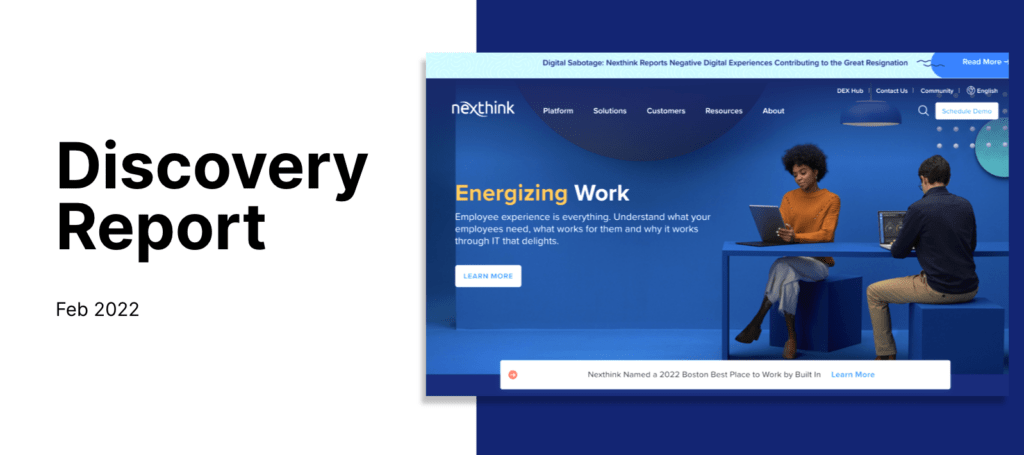
Our ‘Discoveries’ go a long way to help solve this challenge. We bring key stakeholders together with the intention of uniting them around a common purpose and ensuring that everyone buys into the direction of the site before the build commences. During these sessions, we nail down who the key users are and what their needs are, before mapping a clear and seamless user journey through a clear and well-structured site map.

Discoveries
Discoveries (AKA planning processes) are important for these reasons. Our Discoveries focus on five key elements:
- Meeting Goals and Objectives: Being clear on the website’s role helps guide the design process and ensures it meets the needs of the target audience and accomplishes its intended purpose.
- User Experience: Discoveries allow us to map out the user experience by identifying personas, defining user journeys and creating wireframes. This helps to ensure the website is user-friendly and easy to navigate which helps boost conversion rates and customer satisfaction. I’ll dive deeper into this super important element in the next section of this blog.
- Content Strategy: This element identifies the types of content that will be on the website, alongside tone of voice, SEO and how it will be organised. It can also pinpoint gaps to fill and ensure the website’s content is relevant, engaging, and well-structured.
- Consistency: A consistent style, layout and look & feel creates a cohesive and professional website that users find easy to recognise and navigate.
- Time and Cost: Discoveries help identify potential issues and blockers early in the process, which saves time and costs in the long run.
Discoveries are crucial because they set the foundations for a great website. By working as a team to agree the key ingredients, namely objectives and user needs, before build starts, you provide the framework for a shared vision that translates into a smoother running project and a better output
Focus on the user journey
As I shared above, user experience and the user journey are a critical part of web development, and an area where we are seeing much of the industries’ innovation take place. A site needs to quickly open a conversation with the user. Once a user lands on your website, they need to quickly understand what you do and what you can offer them. They shouldn’t have to dig deep to find it
Keeping everything simple and consistent is key. Users should be able to get to the information they need quickly, whether that’s a service, resource, or contact info. If they can’t, they’ll go elsewhere and you’ve lost them. Simple as that.

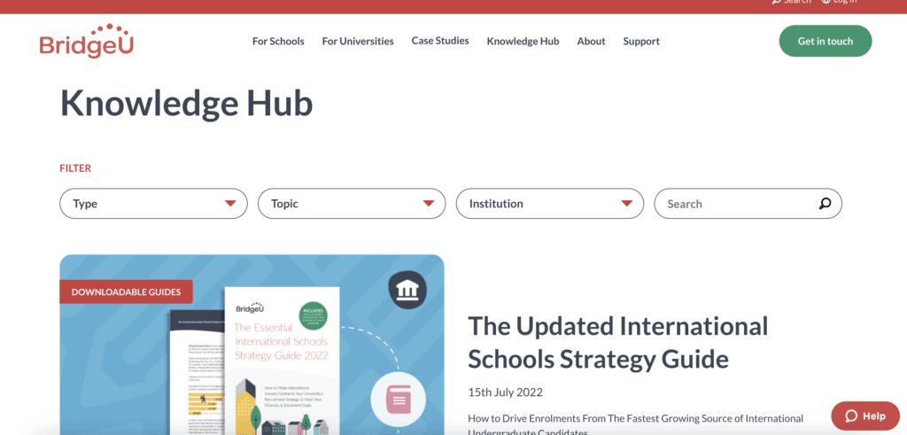
Content needs to be relevant, engaging and well-structured. You need to carefully consider where key content such as guides and resources sit within the user journey so they’re easy to find. You should lead with clear, light messaging rather than in-depth technical jargon. Information overkill can be a problem so keep content concise and avoid leading with the use of overly technical language where possible.
At Clarity, we employ a design technique called Progressive Disclosure to gradually reveal information to users in a way that is easy to understand and navigate. By breaking down large amounts of information into smaller, more manageable chunks, users can focus on what they need to know without feeling overwhelmed. This approach can make it easier for users to find the information they need and complete tasks, ultimately leading to a better user experience
A user’s time is precious so keep your website simple and easy to use. The last thing you want to do is confuse and overwhelm your audience from the get go.
Innovations powering simplicity
Analytics
Analytics and optimisation tools help identify areas which can be used to further simplify and improve the user experience. For example, heatmaps show where users are clicking and scrolling, while user testing can provide insights into user behaviour and preferences. By paying attention to how users interact with your website, you can make adjustments to improve their experience.
Chatbots
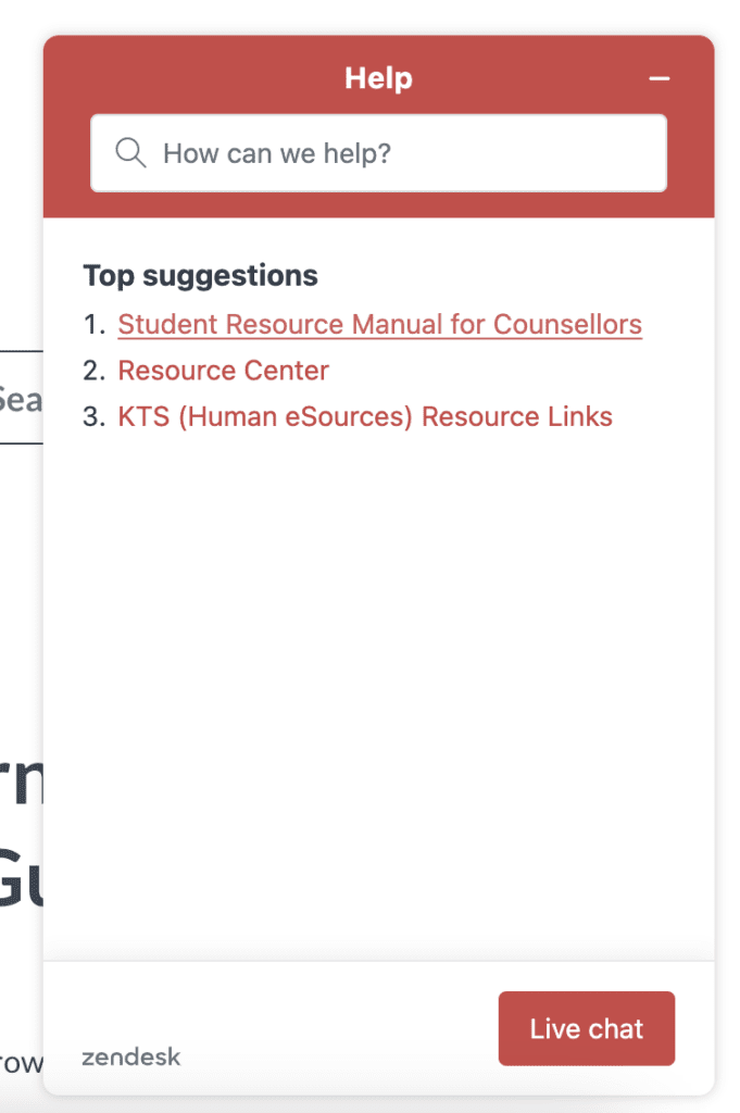
Many companies and websites employ the use of Chatbots to interact with their users. Off-the-shelf chatbot plugins are pre-built and so can be added to a website or application with minimal customisation. These chatbots can interact with customers in a conversational manner, answering frequently asked questions, providing customer support, signposting, or guiding users through a process.
As well as simplifying the user experience, they offer a cost-effective way to allow developers to enhance the capabilities of their websites without the expense and effort of having to customise or build these features from scratch.

Headless CMS
Traditionally, websites have a front-end (the UI or what the end user sees) and a back end (the CMS, where all the content sits and can be amended by web editors). However, with the traditional website stack, the front end is “coupled” with the back end, meaning they all work as a single entity. This can negatively affect page load speed, as all content and assets need to be fetched and rendered on each page load.
A site using a headless CMS liberates you from this dilemma, optimising performance and flexibility. By decoupling the front and the back end, the page content and assets are pre-rendered and packaged within the front end environment, greatly improving page performance.
Translating brand vision into a great site
So, to summarise, what makes a great, user-centric site?
Strategic intent
Without a clear vision, and alignment within the business, you can’t set out your stall. A unified brand experience is key to how you stand out in a crowded market. You need to be consistent, clear on who you are and what you do, and communicate this to your customers in language they understand.
Keep it simple & intuitive
Your website doesn’t have to be minimalist, but a simple approach designed with the user in mind is vital. Keep the navigation menu easy to find and use, and make sure that users can easily find the information they are looking for.
Content is king
Provide clear and concise information about your business, products, and services. Make sure that users can easily find the information they need, and that content is easy to understand.
Improved UX
When a website has a consistent look and feel, it makes it easier for users to navigate and understand the content. Progressive Disclosure helps reduce confusion which can lead to higher conversion rates and customer satisfaction.
In summary, a website that is easy to use, visually appealing, and provides clear and concise information will ultimately lead to a more positive user experience. This not only increases the likelihood that users will return to the website, but it also improves the chances of converting them into customers. By prioritising user experience in your website design, you can ensure that your website meets the needs of your users and achieves your business goals.
And remember, a great website starts with a clear vision.
Learn more about how ClarityDX can build and optimise your website here or reach out to us here to chat with Graham directly.
Let's Talk
Do you have a web design and build project coming up that you would like to talk about?

B2B web design trends 2023: Predictions by actual B2B web designers

What’s Best for UX Isn’t Always Best for SEO – or is it?
Let's Talk
Do you have a web design and build project coming up that you would like to talk about?