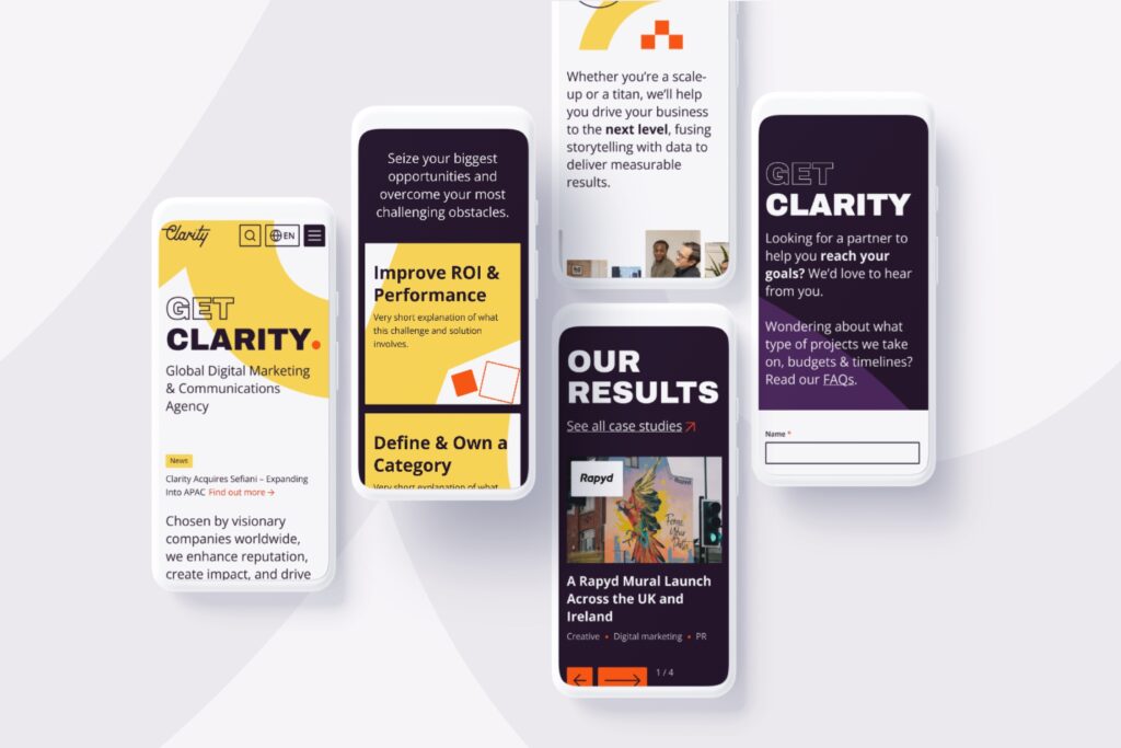
Anthesis
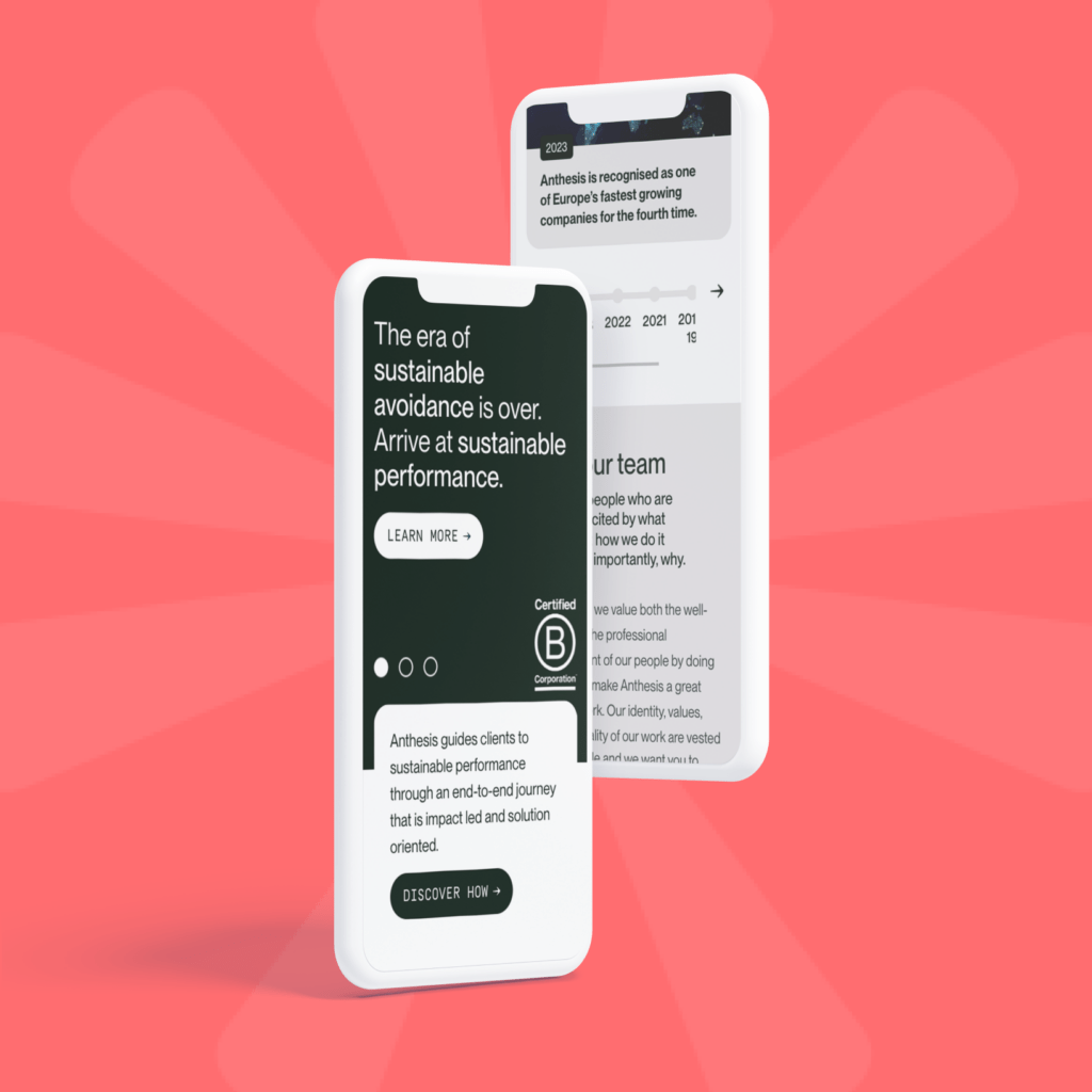
Helping sustainability consultancy Anthesis promote their services and meet their marketing growth goals.
Introduction
Anthesis are sustainability consultants who guide businesses as they transition to decarbonised and more sustainable futures. Headquartered in London, with offices all over the world, Anthesis work with organisations to support their sustainability and climate action aims.
The Challenge
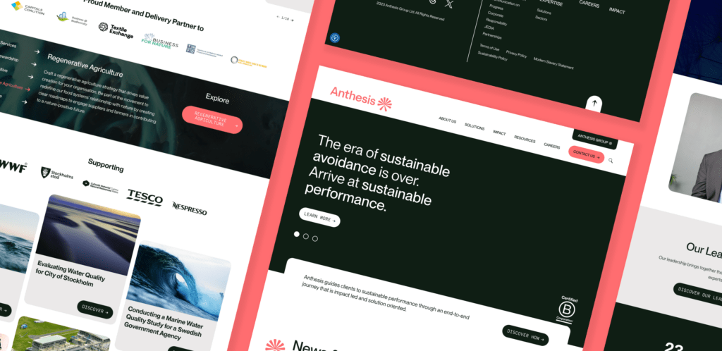
The old Anthesis website required a refresh to better align with changes to the brand design, company’s internal service structure and to make it easier for their internal marketing team to maintain and update content.
The brief was to design and build a user-centric site – aligned with Anthesis’ new service structure – that delivered an improved website experience and helped drive leads from key audiences including future/existing employees, investors, clients and target prospects.
The objectives for the new website design and build were:
-
- Showcase Anthesis as a modern, dynamic, and future-facing organization
-
- Utilize news and insights to illustrate Anthesis’ thought leadership and standing within the sustainability community
-
- Empower the Anthesis marketing team with a flexible and easy to use CMS to market themselves
-
- Build with SEO in mind
The team have been fantastic and I’m really glad we decided to work with you on this project. Professional, supportive and excellent in what you do!
Colin Forrest, Anthesis
Our Approach
All of our website projects follow a 4 step approach (Discovery, Design, Development and Deployment), with each stage building on the last.
The initial discovery phase served multiple purposes, including onboarding, knowledge transfer, user research, and establishing key indicators for success.
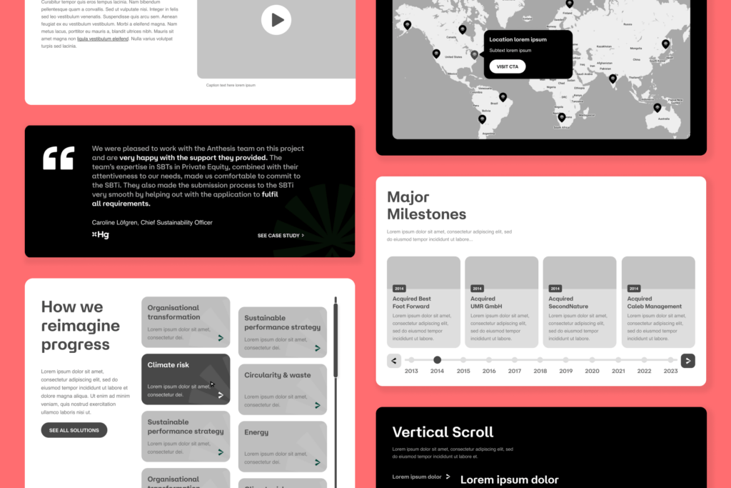
We collaborated with Anthesis to map key user buyer journeys & flows, validate the sitemap & navigation, conduct content mapping and wireframing to ensure the site is user-centric and set up with SEO in mind.
The navigation & structure ensures easy access to key information and directs users through to HubSpot contact forms.
We defined the content ‘blocks’ required for each page template and created wireframes to visualise the layout. We use a design technique known as ‘progressive disclosure’ to ensure content and navigation is clear and uncluttered.
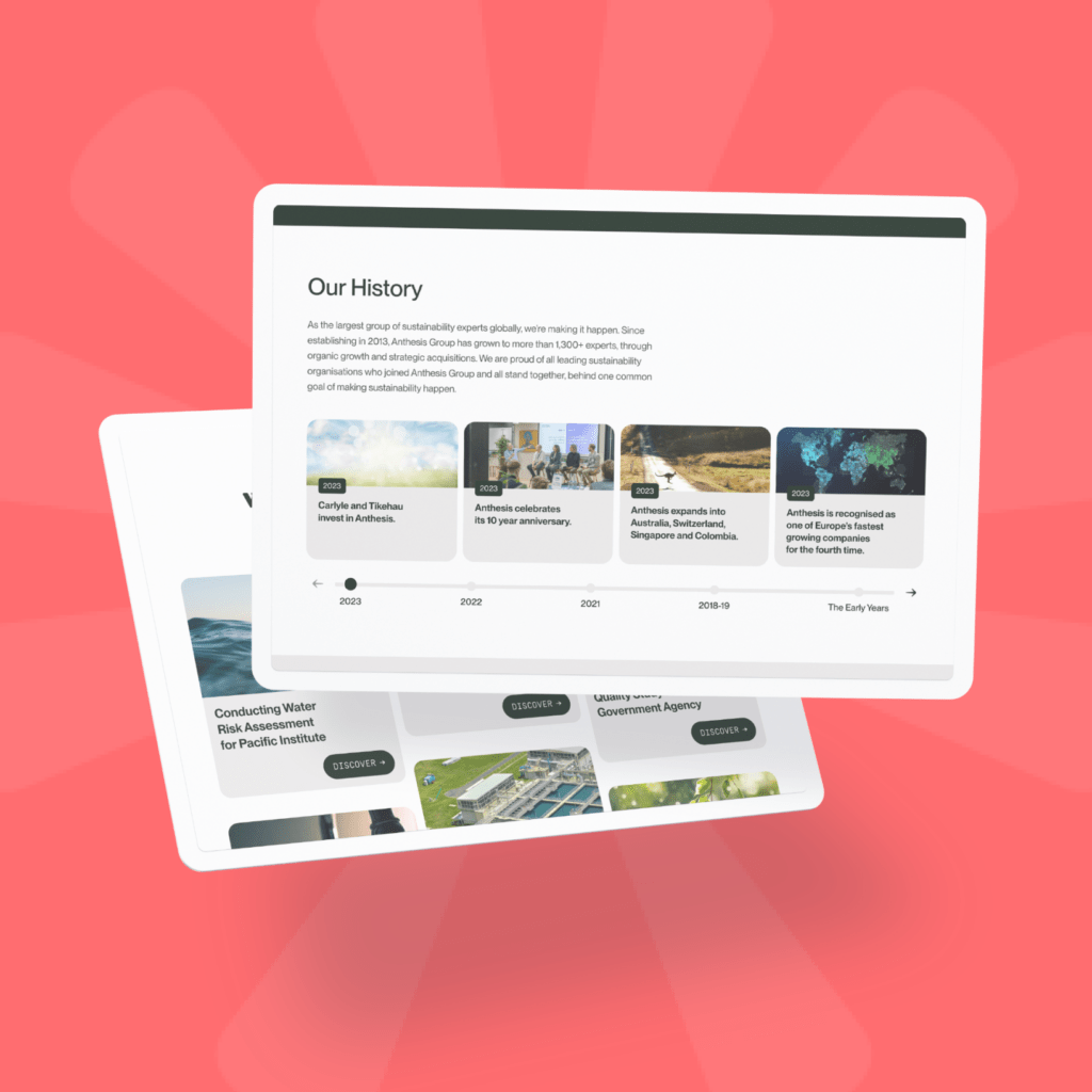
To reinforce Anthesis’ sustainability industry experience and positioning as thought leaders, case studies and news & insight proof points are featured prominently.
Design & WordPress Development
Anthesis had a specific vision when it came to the application of the brand. We were supplied with updated brand assets and design suggestions for how the homepage should look.
Working with the updated guidelines, our designers translated the ambitious offline vision into a workable website design which utilized UX and UI best practices.
The template designs were then transferred to a development framework which utilizes the flexibility of WordPress Gutenberg blocks.
This flexible and scalable system allows the Anthesis marketing team and web editors to easily build out new content, formats and pages using a set of styled blocks without the need for ongoing developer assistance. Utilizing WordPress multisite functionality also means that Anthesis are now able to create additional language sites within their multisite install effortlessly.
Our development processes utilize best practice development standards to make the site light-weight and high performing. This includes,
-
- Enabling server-side caching
-
- Implementation of custom lazy-loading
-
- Custom development to limit use of third party plugins
Google Lighthouse performance on desktop
97Improvement in mobile performance*
33%Notable Features
- WordPress Multisite
- Multilingual
- Gutenberg editor blocks
- HubSpot forms
- Advanced user permissions
- GoToWebinar, Vimeo, YouTube integrations
Let's Talk
Do you have a web design and build project coming up that you would like to talk about?
Kite
