BridgeU
Empowering future generations with BridgeU’s new website
Introduction
BridgeU is a global education and talent company, offering solutions to secondary schools and (more recently) universities across 140 countries.
The Challenge
When Two become One, bringing experiences together.
For schools, BridgeU’s career guidance software enables teachers to guide students through their university application.
For universities, its SaaS (Software as a Service) product and services enable admissions, recruitment and marketing teams to connect and engage with BridgeU’s network of school counselors and students.
BridgeU bridges the gap between schools and a positive future, empowering both students and counselors with the information they need.
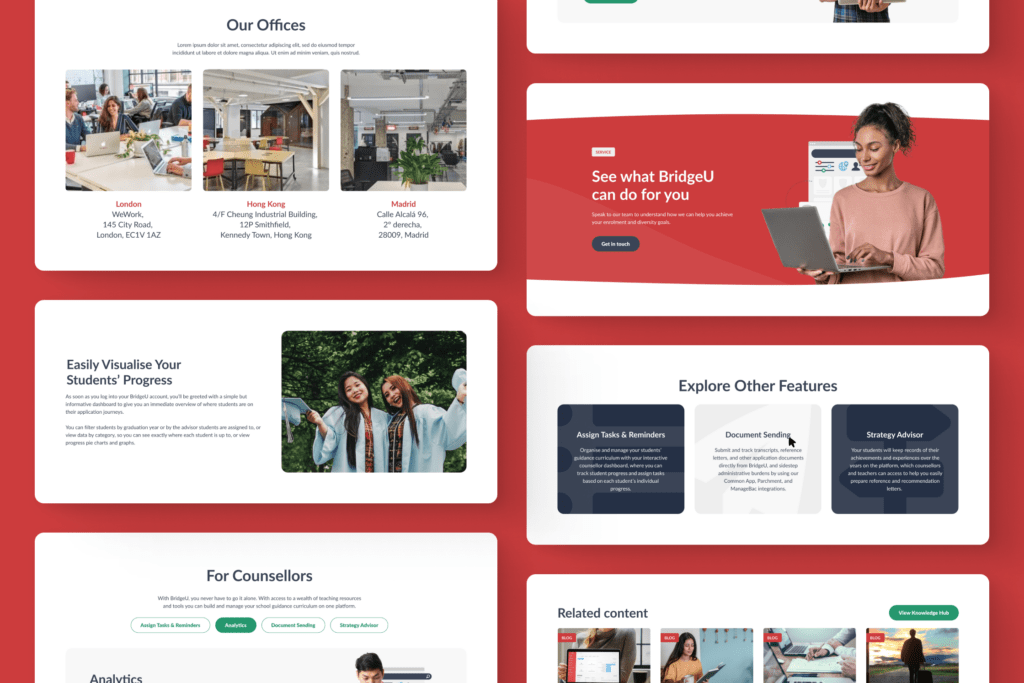
ClarityDX’s mission was to design and build a UX centric, SEO-optimized lead generating machine that would position BridgeU as a market leading EdTech company, with a customer-focused website acting as the foundation of future global marketing and growth strategies.
When the brief landed with ClarityDX, BridgeU’s offerings were presented separately via a primary domain for schools and a subdomain for universities. This set up felt disjointed and from a business perspective BridgeU wanted to unify these into a single domain, with a focus on excellent UX, navigation and content for all relevant audiences.
[ClarityDX] has been a crucial partner in redeveloping BridgeU’s website so that it better aligns with our brand and business goals. As a company with little internal resources in website development or UX, [ClarityDX’s] expertise and experience in this area provided the support and peace of mind we needed to deliver the project in good time and with no issues.
Henry Sadler-Dawe, BridgeU
Our Insight
Simplify for the user and reap the benefits
The original site navigation utilized three different menus for the homepage, school and university sections, which was confusing for the users.
ClarityDX needed to create a single consistent navigation across the whole site that was easy to use for both audiences and still allowed quick access into the content for both areas.
The site also had existing SEO value that had been built up long-term and BridgeU understandably didn’t want to lose this when moving to a new domain.
The solution
A strong foundational discovery prepared for a successful build.
Utilizing ClarityDX’s tried and tested discovery process, we ensured our proposed design and discovery phase would provide BridgeU with the online marketing machine they needed to reach their strategic goals. We:
- Completed SEO research and requirements, providing a summary of recommendations which included a performance review, competitor analysis, keyword research/mapping and an SEO audit
- Created key user journey flows for priority personas
- Assembled a finalized sitemap based on SEO and UX research and best practices
- Crafted a content map to aid wireframing and content strategy for the BridgeU team
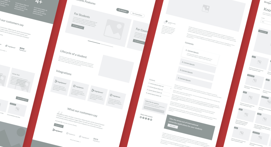
- Created a UX wireframe for key template pages to aid the design and content planning phase for the BridgeU team
- Constructed a technical specification document outlining plans for all structural and functional elements of the future build
- Ideated a design moodboarding and scamps, helping to clarify the design direction and ensure alignment with BridgeU’s expectation for the design stage
These actions allowed us to complete the discovery phase with a fully costed, outlined plan for the design and build phases which would meet the client’s functional needs, delivery timeline and budgetary requirements.
The sturdy foundations of the discovery work meant we were able to design, build and launch the new website in 11 weeks, with the help of BridgeU themselves! Crucial to this success were the discovery steps which consolidated design requirements and allowed us to move through the design approval process with quick sign off. Robust technical review work also rigorously outlined the development requirements for build, with technical features including:
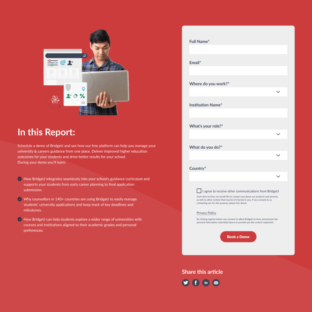
- Seamless integration with three form types: Chilipiper, WS forms and Pardot
- Chatbot integration
- Custom global options for tracking
- Built with Gutenberg blocks for ultimate flexibility
Notable Features
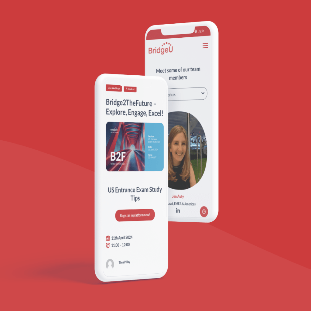
- Simple consistent navigation catering to multiple user groups
- Large-scale resource hubs for both gated and public content
- Intuitive and flexible CMS
- Integration with several form providers
Let's Talk
Do you have a web design and build project coming up that you would like to talk about?
Oxford Economics
