Clarity
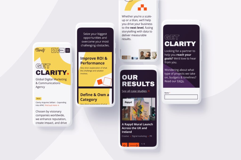
Promoting Clarity's full range of integrated marketing services and driving leads with an updated and refreshed Headless website
Introduction
Clarity is a global digital marketing & communications agency, serving clients across the USA, APAC and EMEA.
The Challenge
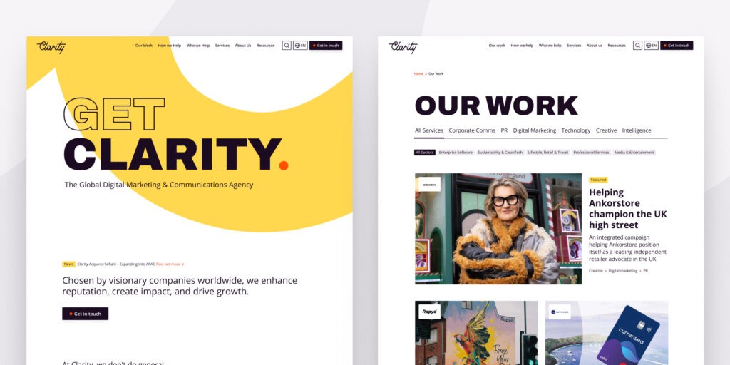
Following a busy period of growth, acquisitions and a rebrand, Clarity’s website required a refresh to better reflect the agency’s expanded service offering and to drive leads across their global portfolio.
Key project goals:
- Demonstrate depth and breadth of service offering for new and existing customers.
- Improve the user experience, site navigation and call to actions
- Help increase lead generation through to pipeline.
- Build with SEO in mind.
- Improve site speed & performance.
Following the rebrand, we needed a site that better reflected our global positioning, harmonised our service structure and drove leads. Being a digital agency, it had to perform and it had to be cutting edge – that’s why we opted for Headless and we’re delighted with the results!
Tom Telford, Chief Digital Officer, Clarity
Our Solution
Strategy, Discovery & Definition
Involving all the key global business decision makers, this initial phase served multiple purposes, including conducting research to understand the customer and CMS user needs, defining the technical scope, requirements and establishing key indicators for success.
Guided by user insights, SEO and metrics, we defined the sitemap and information architecture, planned the user flows for priority audience groups and developed a content map.
A finding of the user research, highlighted the need to bring to life how the various Clarity specialisms deliver integrated solutions within the sectors they serve. This was reflected in the navigation to ensure users could easily find examples relevant to their needs and make contact.
UX/UI Design
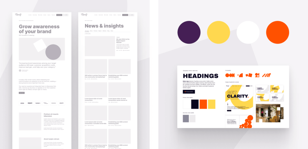
Following the creation of the updated brand and design concepts, our UX/UI designers translated these into workable UI designs using moodboarding and style tiles to quickly share visuals with key decision makers and ensure the design was heading in the right direction.
The style tile provided the direction for how the brand guidelines would be implemented consistently online to ensure excellent usability and accessibility.
The website was brought to life through the application of dynamic design and content, reflecting the new brand messaging, imagery and palette. As always, this needed to be carefully balanced to ensure it was both engaging and easy to navigate without impacting the user’s experience or the site’s speed and performance.

Multilingual
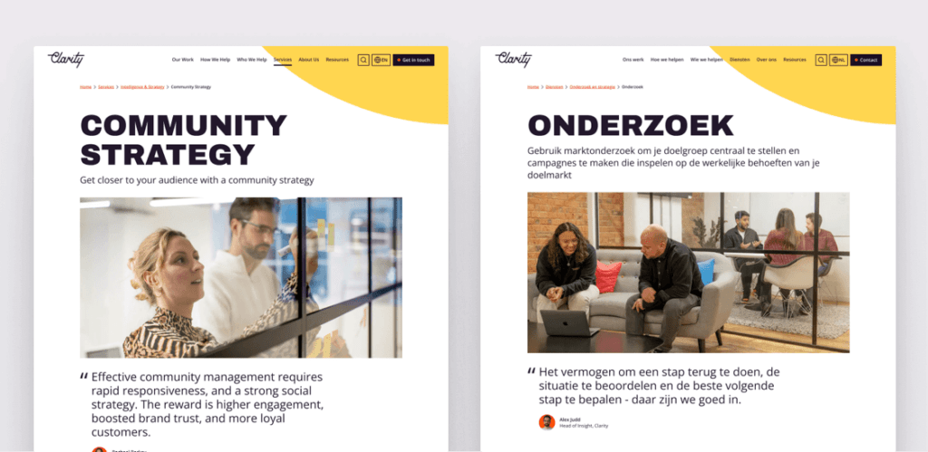
Built with multilingual functionality powered by WPML and DeepL machine translation functionality, the site is built with global scalability in mind.
This allows messaging to be tailored to local markets and target audience needs.
The new website, now operates as the destination for inbound digital marketing activity.
Created with Clarity’s B2B audience and internal CMS users in mind, it simplifies navigation, improves UX, and showcases the updated Clarity brand, global footprint and service offering.
Performance Score
91%Features
- Headless WordPress CMS
- Refreshed Navigation and Brand
- Next.js / Faust.js Frontend Technologies
- Multilingual – WPML
- DeepL Auto Translation
- HubSpot CRM Integration
- Termly Privacy Integration
Let's Talk
Do you have a web design and build project coming up that you would like to talk about?
Anthesis
