Really Ree
The UK’s No.1 beauty blog
Introduction
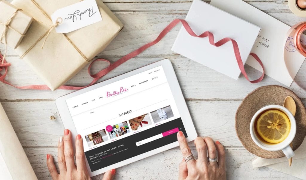
A strategic redesign and build of the UK’s No.1 beauty blog to drive the transformation from personal blog to leading digital media brand.

The Challenge
ReallyRee.com began life in 2010 as the personal blog of founder Ree, who wanted to share her passion for all things beauty with as many people as possible. Those first few followers have now grown into half a million readers a month and Really Ree has become the biggest beauty blog in the UK.
Really Ree needed an experienced partner agency to help them take the considerable leap from a personal blog to fully functional online publication. The challenge was to retain the underlying values of the Really Ree brand, whilst also updating the look to be more modern, clean & glamorous.


The Solution
Content is King
Really Ree’s network of 30+ contributors create a huge amount of content, all of which needs to be effectively managed both as an editorial workflow and for users to navigate content. Therefore, we implemented a system whereby articles can be ordered chronologically, or in a custom order set by the editorial team.
This increased flexibility is also reflected in the ‘Related Articles’ section at the bottom of each page which can be tailored precisely to the user’s interests.
Advertiser Appeal
Key to Really Ree’s transition from blog to cutting edge digital publication was increasing its attractiveness to online advertisers.
Ad revenue is a big part of the brand’s business model and so a more modern looking site, paired with extra functionality helps position the site for advertisers.
The new design allows editorial & advertorial content to sit naturally alongside each other without being detrimental to the reader experience.
Content Personalisation
One of Really Ree’s key aims with the new site was to reduce the amount of users who found them through Google, read an article, but then never returned. The solution to this lay in building trust with their users by reliably & regularly providing them with content they wanted to read.
One of the ways we tackled this was by building ReallyMe – a personalised search function which would suggest articles & products based on the user’s appearance and taste.
Affiliate Commerce Integration
Users of the old site were often frustrated that they couldn’t click-to-buy the products they were reading reviews of.
Really Ree saw an opportunity here to not only offer increased functionality, but also to generate affiliate marketing revenue by partnering with e-commerce websites which sold the products.
If the product hasn’t been released yet, this button is replaced with an email capture device which notifies the user when the product is in stock, and is a great way for RR to grow their email list.
What Our Clients Say
The team at [ClarityDX] understood exactly what we needed from our new site and came up with a fantastic design that has really moved our business forward. Their suggestions for new features greatly improved usability for our readers and have made our site more modern whilst still retaining the essential look and feel of our brand.
The team were easy to contact, friendly and reliable from start to finish. I would highly recommend ClarityDX to anyone who needs a new or updated website.
Rebecca Varley, Really Ree
Let's Talk
Do you have a web design and build project coming up that you would like to talk about?

Bankable

