How brand guidelines help to deliver your B2B website design project

If you’re about to commision a new website you probably have a lot on your plate. With everything you need to pull together to get the project underway, brand guidelines might not be at the top of your list. But whilst we always encourage our clients to fix their strategy before focusing on aesthetics, we find brand identity is sometimes undervalued, and needs your consideration earlier than you might expect.
Unlike some creative flourishes which are best conceived once your site structure is in place, good brand guidelines form a strategic underpinning to many elements of your site. Aspects of branding may be considered ‘fluffy’ by some, but there are practical, tangible benefits to clear brand guidelines that are worthy of your attention.

I don’t say this only as a designer who wants to make the most beautiful product I can. Good branding is central to good design, and good design brings real returns. In this article I will explain how starting your project with solid brand guidelines makes for a result that delivers better on strategic aims, and does so via a more predictable, less painful process.
What do we mean by brand guidelines?
Every business has a brand by default – this is simply the way your company is perceived by others. But your brand might not have been consciously cultivated to achieve your objectives, and it might not be properly understood by everyone within your organisation.
A brand (or style) guideline is a tool to document the values of your company, and an explanation of how these qualities are communicated to your audience. This generally takes the form of a manual of “dos” and “don’ts” that sets a standard for visual outputs, and ensures that any materials your company produces are consistent.
What do brand guidelines include?
We see a big range in the depth of content included in brand guidelines. The spectrum looks something like the following:
- No brand guidelines, or very dated guidelines that are now actively ignored.
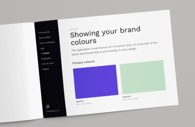
- A PDF showing logos, fonts, and colours. It may also include icons, imagery, and examples of application e.g. letterheads or slide decks.
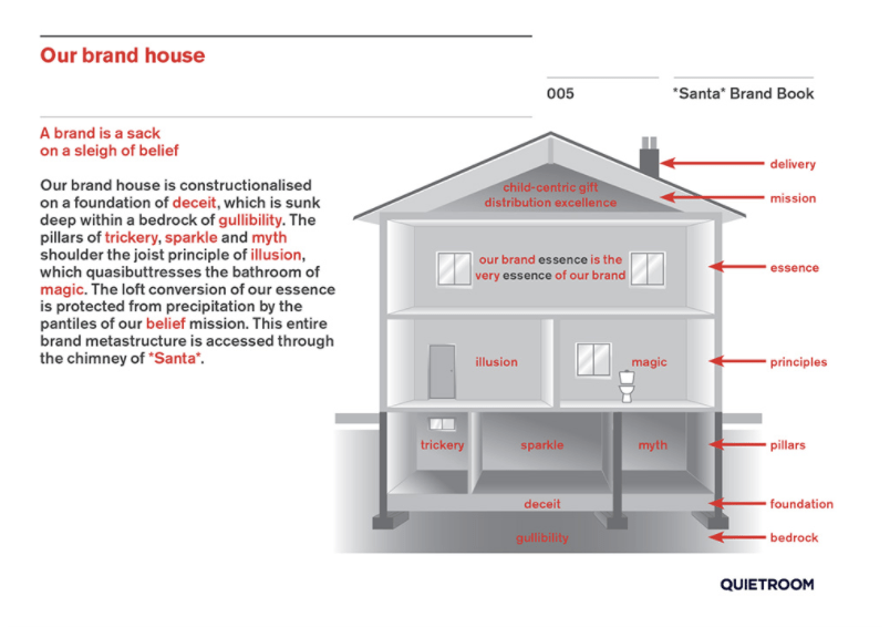
- A brand book detailing brand character, mission, and tone of voice, as well as visuals that are created to reflect these qualities.
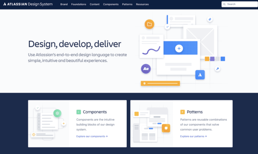
- A comprehensive online brand or design system. This can include everything previously mentioned, as well as digital-specific features such as link, form, and hover styles, responsive display, and interactive behaviours.

Full design systems are how large organisations maintain a strong, cohesive and professional feel across all their digital output despite ongoing development and large teams. High quality interfaces look simple and straightforward, but in reality this is the result of a lot of underlying thought, process and management.
For the average website design, this level of detail isn’t necessary. But if your business’s guidelines are on the lighter end of the spectrum, I recommend taking the time to consider why your company chooses to use the colours, fonts and images it does. Go beneath the surface of these decisions to get to the heart of what drives the organisation and what you offer to your customers. This is what you should be trying to communicate to your audience through every touchpoint you have with them – including your website.
Specifying your logo, palette, and typeface will help your new site to fit better visually with other materials, but it won’t help an outside agency to understand the character of your company or your USP. In turn, this won’t be communicated as convincingly to your customers.
If you need to create or re-work guidelines, I would also advise you to get input from someone who works in digital design. Not everything included in the type of online ‘design system’ previously mentioned is needed, but there are some features of digital design that differ from print. For example, there are limits to the visual styles it is possible to achieve in code, and styles used on a webpage template will need to be flexible enough to accommodate different images and content across a whole website.
How does branding make for a better end product?
Creating better usability
The majority of re-design briefs we work on reference a lack of clear user journeys and an excess of usability issues. Often this is remedied through attention to information architecture and content, but visual components are also crucial.
Consistency in styling is hugely influential as an ‘invisible’ design feature that removes obstacles to delivering your message as directly as possible. Forming rules around the use of things such as typography and palette is necessary to create relative meanings between elements on a page. This enables you to direct your user’s attention to the most important messages and actions available to them.
Without a set hierarchy of fonts or established uses for different colours, an interface becomes confusing and less effective in delivering on your objectives. When you consider that the average time spent on a website is around two and a half minutes, it’s easy to see how important it is to get your message across quickly and clearly.
Commanding more attention
Although extremely important, designing for basic usability is not enough in itself. According to Adobe, two thirds of people prefer to spend a 15 minute time limit consuming content that is beautifully designed, rather than something simple and plain. 38% of people will stop engaging completely if layout or imagery is unattractive. So appearances matter in the attention economy. Your website audience is not a captive one, and at the click of a button users can navigate away to a competitor offering. This makes creating a strong and memorable impression essential.
An impactful design is one in which all the individual elements point consistently in a single direction. This is then interpreted by the audience as an identifiable and memorable whole. Brand guidelines that specify and explain this direction are what allow for the creation of a website greater than the sum of its parts. The value-laden messaging you write about your products will fit seamlessly with the visuals your web designer creates, which will marry perfectly with how your developer codes them to behave. Without a mutual reference point, it’s easy for different workstreams to diverge in ways that are hard to remedy within limited timeframes.

Increasing conversion rate
When it comes to promoting conversions, those in B2C businesses probably won’t need convincing on the importance of branding to their success. Some in B2B companies may remain cynical. In comparison to a B2C purchase, B2B buyer journeys are usually more lengthy and complicated. They are undertaken by more people, and require greater rational justification. Despite this, B2B decisions remain human decisions—even if they must comply with the procurement department’s checklists.
There has recently been a shift toward the understanding that decisions we believe to be purely rational are, in fact, still led by emotion. We get a gut feel of the choice we want to make, then work backwards to justify our decision to ourselves and others. If you (or your boss) need further convincing on this point of view, I recommend watching this persuasive Ted talk from Simon Sinek, or listening to our Clarity Performance B2B marketing podcast ‘The B2B Marketing Objectivity Trap’ with Rory Sutherland, Vice Chairman of Ogilvy UK.
Of everything that might influence the all-important first impression your website makes, a study by Missouri University of Science and Technology found that 94% of such factors are based on its visuals and design. Good website branding will help shape your users’ first gut-feel towards one that benefits you.
How do brand guidelines make for a better project process?
You might be wondering whether the brand guidelines themselves are required for gaining the benefits described above. If budgets and timescales are tight it can be tempting to think that you can save on time and money by addressing all of your design concerns at once. Perhaps even producing brand guidelines as a result of—rather than as an ingredient into—the web design process.
Unfortunately, designing an effective and usable website interface is a big task in itself. Adding the requirement to build a brand simultaneously is unlikely to end in as much success as when the elements of the brand can be considered in their own right. With deadlines looming there will necessarily be limits to the research and experimentation that is possible. If you haven’t set and agreed your core values and design direction beforehand, you’re more likely to end up with a ‘safe’, neutral result than something more creative that risks being rejected as off-brand, even if it is beautiful.
Encouraging targeted feedback
Clarity in the task at hand is equally important when agreeing feedback and providing sign-off. Opinions on design can be subjective, and it’s crucial to ensure you have internal alignment on what best represents the brand, and what the web design should be aiming to achieve. That way there is an objective measure for success and you won’t find yourself in a stalemate between the personal tastes of different parties.

Crafting brand guidelines can be hard as it may bring to light differences in how individuals perceive your company, and how they want it to progress. Don’t let this put you off though. However difficult it may be, it is much easier than attempting to resolve such conflicts in the middle of a web project when design has begun and you can’t discern whether feedback relates to personal preference, brand appropriateness, or usability concerns.
Whilst it can sometimes be tricky, cementing brand guidelines can also be an engaging and motivating way to get lots of people involved in the project at the outset. To make a good website there is often a lot of difficult thinking and planning to be done in the early stages, and undertaking branding work can be an antidote to the tendency to want to rush through this critical piece in order to get to what the finished site will look like.
Maintaining design integrity
Even after it has launched, the process of developing your website is never truly over. To be effective, your company’s digital presence must be constantly under review, and evolving to meet the needs of your business. It is likely you will have people working on your site who were not involved in the original build, and who don’t have a design background. A brand guideline makes a helpful tool to ensure that whoever joins your team or becomes responsible for managing the site is able to do so without damaging prior design efforts.
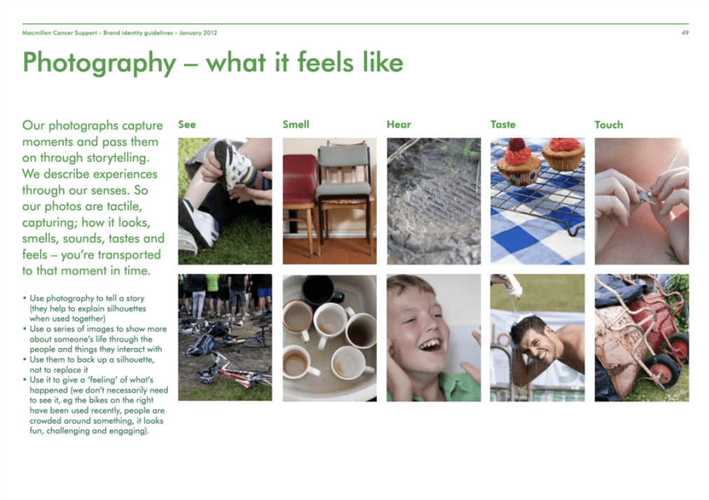
For example, poor blog images are a common complaint we see in website briefs. Outlining what type of visuals work best, which should be avoided, and why they must be consistent in style can help point people in the right direction. The effectiveness of this however—as with anything included in your guidelines—will always rest on how well they are adhered to once no one else is watching.

In Conclusion
To run a web design project that proceeds as expected and generates results equal to your targets, good brand guidelines are a huge asset. Though it is possible to make a website without guidelines, you might find it is one that delivers an underwhelming return on investment due to:
- A less usable interface to deliver your message
- A weaker voice in comparison to your competitors
- A lack of the emotional impact that leads decision making
- Expanding deadlines and costs caused by avoidable internal conflicts
- A degradation in website quality over time
Brand guidelines should be considered purposefully and practically, and need not exceed the cost of their effectiveness. If appointing branding consultants for an extensive rebrand is out of reach, producing guidelines internally is a legitimate option if you have the appropriate understanding within your team. Alternatively, creating brand guidelines can form an inclusive part of a web design process. An added benefit of this is that they will take into account digital-specific requirements that aren’t always considered by an external creative agency.

Why does your B2B marketing strategy need a podcast?

Core Web Vitals: tips to optimise LCP (Largest Contentful Paint)
Let's Talk
Do you have a web design and build project coming up that you would like to talk about?