5 B2B website best practices for 2022

Your B2B website provides the opportunity to give your company a big boost through inbound marketing and reduced friction of the buyer journey. A well-designed, strategic B2B website can act as your digital marketing machine that makes conversions and leads skyrocket.
In a competitive B2B space, the best B2B websites are built and designed strategically. They strike their users’ interest from the get-go, and keep users engaged with relevant content to nurture that interest and build trust and familiarity. Great B2B websites limit bounce rates and encourage users to convert to customers or leads.
So how do you bring a strategic B2B website to life? B2B websites powered by the flexible, open-source, and scalable WordPress are on the right track. WordPress is easy to use and highly intuitive, as agreed by the 455+ million sites that use it today.
We’ve listed the five B2B website design best practices for 2022 so you can build a digital marketing machine and get ahead of your competition.
B2B website best practice 1: Make your site navigable
This first B2B website best practice is often overlooked, but a site that’s hard to navigate is one in which visitors will get frustrated and leave, maybe for good! Think about how much information your B2B website holds. Using UX best practices to present information at the right moments and in a digestible format is key to effectively portraying your mission, vision and values.
In B2B in particular, products and services can often be complex for buyers to understand. Your menus and site architecture need to be clean and straightforward so that users can focus on their challenge at hand. Less is more when it comes to top menu items, which should provide clear and relevant options to meet a user’s needs and expectations.
For example, Evernote has anticipated their user needs by presenting likely options for each user persona that might land on their homepage. They offer ‘Why Evernote’, ‘Features’ and ‘Plans’, to help people navigate from their homepage and find what they’re looking for.
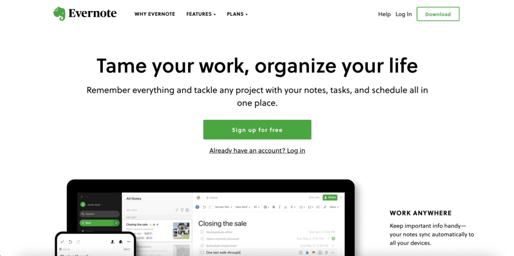
Mapping your site as a whole will help you see potential user journeys. On the user interface side of things, there has been minimal correlation between better UI and Google ranking. However, having a navigable B2B website will increase engagement and time spent on your site and therefore will increase your Google ranking. With a higher website ranking on Google, you’ll gain more inbound traffic, which paired with a good site navigation will increase your leads and conversions.
The best B2B websites get messages to users in the most accurate, clear and accessible way possible. They provide clickable opportunities, present the right information at the right time and suggest next steps in a helpful way.
B2B website best practice 2: Create call-to-actions that work
Calls-to-action (CTAs) play a vital role on a B2B website, as they guide your users through their buyer journey, keep them engaged with your content and can convince them to convert. Calls to action should anticipate the needs of the user by offering valid and enticing suggestions of where to go and what to do next. For example, if you’re interested in B2B web design best practices, read this ultimate guide to B2B web design.
From a B2B website design perspective, calls to action typically take the form of colourful buttons that appear separate to and distinct from text in order to stand out on a page. High converting CTAs are no longer than four words, such as ‘try for free’, ‘book a demo’ or ‘download now’.
For example, look at Pathmotion’s ‘book a demo’ call to action. It’s colour is on brand and stands out against the blue of the text. They have the same demo buttons across their site to maintain consistency and increase familiarity. The title ‘Try Pathmotion Now’ adds urgency, with supplementary copy underneath that further incentivises the user by explaining how the demo will benefit them and solve their challenge.
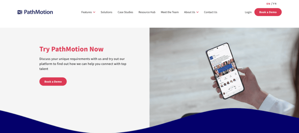
The testing of call-to-actions can be a gradual process, and one that you can refine over time. You can experiment with different button colours and text and measure how this affects your conversions and click-through rates.
As with all of these B2B website best practices, think about call-to-actions on your site in the context of your business objectives. What do you need your users to do when they land on your site to help you achieve these objectives? Whether that’s booking a demo, scheduling a sales call or starting a free trial, ask your users to do so with a bright CTA.
B2B website best practice 3: Convey a unique value proposition
B2B marketplaces can be highly competitive, with saturated categories and similar products threatening to divert your prospects and dilute your brand. So, how do you make your brand stand out among your competitors? You need a unique value proposition. One that is obvious to users on your website and gives reason as to why a customer should pick your solution over others.
To make your value proposition clear, it should be immediately visible on your homepage and landing pages. Unbounce is an excellent example of this: in their value proposition, they provide a user-centric proposition that explains how Unbounce will help achieve their goals with their tools. They also let their visitors know that 15,000 brands use them to establish trust through social proof, and then feature a call-to-action underneath to guide a user to their next step.
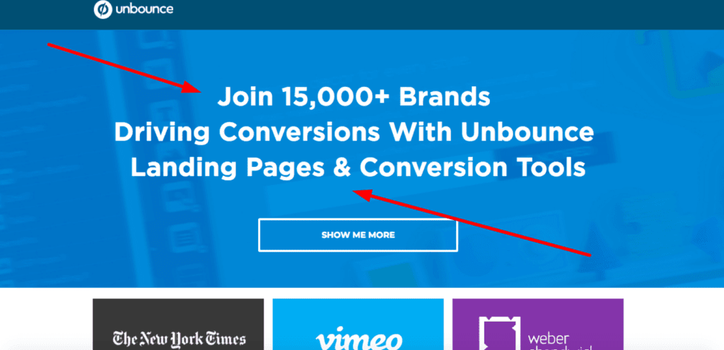
Your value proposition needs to show what you do, who your customers are, and how you’re different from the rest of the market. From there, it’s about having a good sense of clarity, specificity, and enough uniqueness to the service or product you provide. Your value proposition should be understandable within around five seconds; any longer than that, and there’s a good chance it’s too complicated.
Content across your site can help define your value proposition further. This could be consistent messaging on each page, and long-form blogs that establish your value proposition within educational and impactful information.
B2B website best practice 4: Be mobile-friendly
Mobile traffic continues to grow in B2B as business buyers take their work with them wherever they go. What was once an option is now a necessity: your site needs to be mobile-friendly and responsive to smaller screens. A website optimised purely for desktop will distort it’s layout on a mobile device and leave the user confused and frustrated. You could lose your one shot at establishing a relationship with this prospect.
From an SEO perspective, Google favours websites that are mobile friendly. Again, increased ranking is better for your B2B business! So start thinking about how to optimise your B2B website for mobile through responsive web design, dynamic serving or separate URLs.
For example, look at how Kadence International, a global market research agency, made their site mobile-friendly:
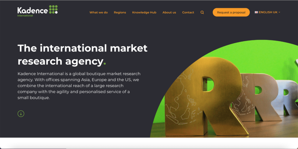

Kadence International made the layout of their website responsive to mobile to better suit smaller and portrait-shaped frames. They maintained their emphasis on ‘the international market research agency’ and following text to establish their value proposition. They also offered prominent language settings to account for their global audience.
B2B website best practice 5: Boost page performance and speed
In Google’s latest Core Web Vitals update, they named website performance as a highly important factor in determining search ranking. As we know, SEO is a critical part of a B2B marketing strategy and should be accounted for within the design and build of a website. Website performance is largely affected by page speed and asset loading times, so one of the most important B2B website best practices is the speed of your site.
The average user expects a website to load in around two seconds after they’ve clicked a link. Any site that takes longer than those two seconds will likely see visitors leave for good—this increases your bounce rate, which Google does not like, and decreases conversions as you miss opportunities to nurture relationships with website users.
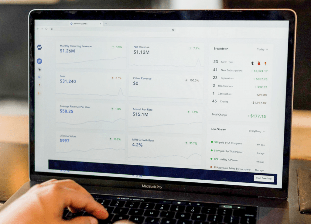
Some quick tips to increase the speed of your site include:
- Limit the number of redirects
- Optimise and compress your images
- Limit the number of plugins your site uses.
In fact, there are plugins available on WordPress that can boost your site speed by automatically resizing images and deferring JavaScript loading for you.
What’s new in 2022?
2022 will see the phase out of third party cookies by Google, which means B2B marketers have to get extra savvy in order to track website visitors, who they are and where they’ve come from. Third party cookies have been heavily relied upon to perform retargeting campaigns, attribution, ABM and content optimisation. But after 2022, you’ll have to rely on first party cookies from your own website instead.
This means your B2B website needs to be equipped with the right tracking tools, to see which channels are successfully building your brand, generation leads and producing ROI. Tools such as Lead Forensics, which uses reverse IP lookups and private databases to find the names, companies and contact details of website visitors.
Summary
With marketing built-in to its core, a B2B website can drive leads and conversions and bring you closer to reaching your business objectives. If you want to stay ahead in the increasingly digital B2B marketplace, your website has to be a strategic marketing machine. It’s time to take action if you’re not making the best use of your site.
If you want a new and improved strategic B2B website, reach out to the ClarityDX team and we’ll take care of the rest.

Meet the team: Frankie

Top 9 B2B web design trends for 2022
Let's Talk
Do you have a web design and build project coming up that you would like to talk about?