How great B2B websites can shorten sales cycles

What is a B2B sales cycle?
As you know, there are a lot of steps in a B2B sales cycle, which means it can often take a long time to close deals and gain customers. This is especially true in B2B tech and SaaS where marketers are faced with multiple decision makers, high product costs and aversion to risk which plagues business buyers who opt for ‘no decision’ over putting their job on the line. On top of all that, smaller pools of leads make each one even more critical.
At ClarityDX, we know the headache of a long B2B sales cycle and we know how to soothe it… with a great website! Websites can support the sales cycles end-to-end with content rich experiences that drive awareness, engagement, acquisition and conversion whilst supporting a prospect’s education. In this article, I’m going to let you in on our website design and development secrets, and how UX centric and frictionless digital experiences can shorten the length of your B2B sales cycle.
SEO and content
All great B2B websites have strategic SEO built into their core, to drive inbound users to the site and to generate leads. Lead generation is the main objective of SEO for two thirds of B2B tech marketers, and it’s no wonder why, when SEO that’s built into a website can be a lead generation engine that keeps users converting to qualified leads constantly, starting them on their sales cycles.
With a plethora of relevant, keyword optimised content on your site, your target audience is bound to find you as you increase your domain authority and appear at the top of search results. But it’s also important to have a content strategy embedded in your website to supplement a prospect’s qualification stages throughout the rest of their sales cycle.
As they embark on their own research, helpful, valuable and relevant content will drive a prospect through their decision making process. According to the traditional digital marketing funnel, they should learn more about their challenge, how they can solve it and what you offer.
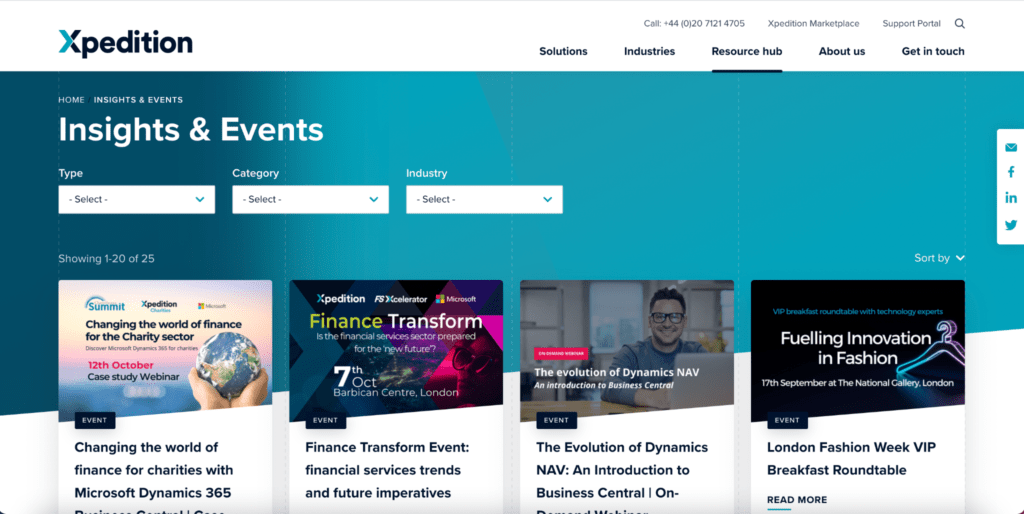
This content should be easy to discover on your website, located in a centralised resource hub that has pillar pages for enhanced SEO. For example, take a look at tech company Xpedition’s resource hub here:

There is immense value in having a dedicated ‘resource hub’ or ‘content hub’ on your B2B website. Within this hub, all of your various types of content can be found through search, sorting and filtering functions. This will enable users across their decision making process can quickly and easily find the content they need.
CTAs are a great way to help a user navigate between pieces of content. For example, a ‘contact us’ CTA at the bottom of a ‘top of funnel’ blog post might be too soon, so it might push a prospect away. Instead, this CTA could be a good opportunity to promote relevant content, and to provide the reader with deeper information on the topic they’ve already shown interest in.
As an added bonus, offering valuable content upfront increases trust, which down the line makes for a smooth and more balanced relationship between a sales representative and the lead. It becomes less of a ‘sales pitch’ and more of a ‘how can we work together to solve this challenge?’ With a balanced relationship between Sales and lead, the sales cycle shortens as both sides are willing to collaborate with less resistance.
All in all, the more time spent on your website reading content and learning about your solution, the more likely it is that a user will become a qualified lead in less time and with less pushing from a sales representative. Make sure your B2B website has an abundance of relevant resources to help your prospect move through the sales cycle at their own steady pace.
Navigation & Information Architecture
On a bad B2B website, there are many obstacles users have to overcome to learn more about their challenge and solutions; hidden menus, poorly placed pages and unengaging CTAs. These can push a prospective customer away from your site, lengthening the sales cycle and potentially ending it altogether.
A UX optimised B2B website will guide a user through their own research by anticipating their needs, offering value and delivering relevant information at the right time. A great B2B website means a user doesn’t even have to think about where to go next or where to find something, rather it is presented to them. You can achieve this with accurate and proficient user journey mapping.
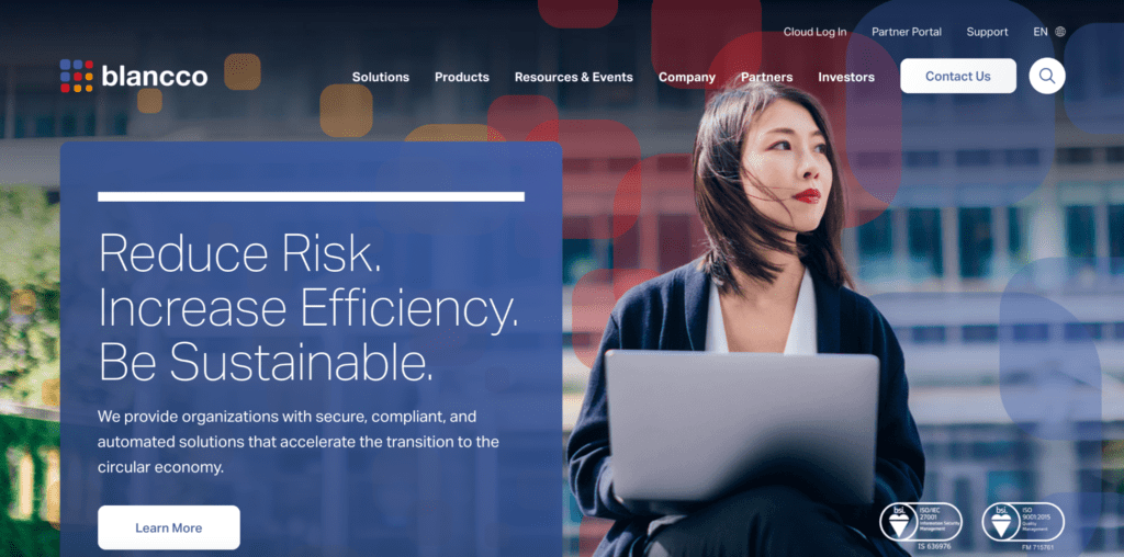
One helpful tool for enabling smooth navigation is search functionality. For users who know what they want when they visit your site, a clear search bar is a shortcut to their desired page. All it takes is a symbol of a magnifying glass in an expected position, such as on cybersecurity company Blancco’s homepage here:

A website should support a B2B sales cycle by making self-driven research phases and decision making processes as easy as possible. This will lessen the time spent by Sales presenting information and persuading a lead to read it. The more time spent on your site, the more a prospect feels like they know and trust your brand, and the quicker the sales cycle will be.
CRM
All great B2B websites have a marketing automation or CRM integration to track a prospect’s progress in their sales cycle and to help a Sales team nurture the relationship.
We all know Sales and Marketing teams can struggle to see eye to eye, so having all interactions recorded in one place in a CRM can ease tension and reduce confusion. From a prospect’s perspective, they won’t be presented with conflicting or repeated messages and they won’t have to suffer through an awkward handoff from Marketing to Sales.
In a CRM, you can assign contacts to a single sales rep, and therefore assign full responsibility for individual leads, and you can set reminders for next touch points to keep the relationship steady and moving forward.
CRMs often have automation tools that do a lot of the marketing and sales work for you whilst giving sales colleagues lots of visibility of the prospects past behaviour – for example which pages or case studies they have viewed, or content they have been reading When a prospect registers for a newsletter, report or event, a marketing automation tool will send them a follow up email and make them feel welcomed. Marketing automation tools ensure every lead stays warm, even when not in direct contact with Sales.
Here’s an example of an integration between a WordPress site and Salesforce, to achieve a ‘single customer view’ and shorten your B2B sales cycle.
Chat
As instant messaging becomes the norm in personal and business interactions, a B2B website needs to accommodate this modern mode of communication. Having a chat function on your B2B website can link a prospect directly to sales to provide guidance throughout their sales journey.
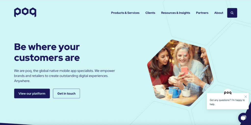
Check out this chat function on mobile app company Poq’s website:

They’ve used live chat for human to human chat within business hours, but another chat option is chatbots. On a B2B website, these can greet a user and assist them by answering FAQs and sending relevant pieces of content. They can be used any time, but aren’t as accurate as a human salesperson and relying wholly on a chatbot may be a missed opportunity to present to prospects in person and overcome their objections.
Quick tips
Transparent pricing
Transparent pricing, even in more enterprise sales journeys, makes your company seem positively upfront with what a prospective customer should expect. Cost is one of the biggest factors in a B2B decision, and budgets are usually set and not actually up to the person buying the product. Knowing that your solution fits within the budget of the buyer gives them the confidence to proceed with their research and decision making process.
HubSpot does a great job of transparently and clearly outlining their pricing, even for their more enterprise solutions. This shortens the sales cycle by giving buyers upfront information, and reducing the time needed to qualify opportunities and results in less of a wait for a buyer to engage with your team.
Landing pages
Landing pages on a B2B website are great for speeding up sales cycles because they are highly personalised and offer things a user cannot resist. They can generate leads, get people to sign up for free trials and get prospects to consider your product or service as a viable solution.
Personalisation
Personalisation can make a prospect feel like your service or product was made for them. Recommending articles or suggesting pages can keep users on your site for longer and keep them interested in your brand.
To summarise, a great B2B website can be strategically built with long B2B sales cycles in mind. By implementing SEO, a content plan, navigation that anticipates user needs, CRMs and chat, your sales cycle can be shortened and your marketing targets can be met with speed.
All examples mentioned were designed and developed by ClarityDX, London’s leading B2B Enterprise WordPress Agency, empowering ambitious B2B tech and SaaS marketers for success. Get in touch.

Tips and tools for B2B marketers getting started with website personalisation

10 of the best B2B web design examples
Let's Talk
Do you have a web design and build project coming up that you would like to talk about?