How to optimise a B2B tech website for talent acquisition

In tech, you’re not just competing for customers, you’re competing for top talent too. Especially in the current climate of remote work which ungates a wider job market, and low tenure of younger workers who move from job to job to ensure pay jumps and compatible cultures.
Then you’ve got large companies flexing their ‘coolness’, paving the way with free Ben & Jerry’s, midday surf sessions and pawternity leave. Let’s not forget the serious benefits prioritised most by modern workers – wellbeing, work-life balance and ma/paternity leave.
On top of all that, there’s an acute talent shortage in tech, sweeping business news outlets and forcing companies to ask, ‘how can we compete and attract the best?’
I’ve got an answer: Optimise your website for talent acquisition.
How? I’ll break it down page by page.
The ‘careers’ page
Let’s start with the most obvious – the ‘careers’ page. Prospective employees know that you have a careers page, and they know that they want to get there. Don’t believe me? 89% of job seekers agree that an employer’s career website is important for finding key information! This is why it’s essential that your careers page be immediately accessible from wherever a user lands on your site.
Once they reach it, again they should be met with easy navigation. For example, it is useful to have a search function that can sort job vacancies by location, title and category.
The job listings that appear in the results should be specific, full and descriptive of expectations so that prospective employees feel confident in their application. It would help to include a timeline of the hiring process, as 83% of candidates say this would greatly improve the overall experience. As well as all this, having an obvious ‘apply now’ call to action will encourage users to move forward with their application.
As word-of-mouth continues to shine in B2B tech marketing, it has immense value in talent acquisition as well. On your career’s page, social sharing capabilities are an absolute necessity if you want vacancies to infiltrate niche networks and garner high-value attention. It’s as simple as popping a LinkedIn or Twitter logo beside each listing with a link to share.
To supplement your job listings, you could provide relevant content that sheds light on what it’s like to work with you. This will remind applicants you are a company of humans, not job listings, to build trust and emotional resonance. Find out what keeps your current employees engaged and loyal to your company, and chances are prospects will be attracted to that too.
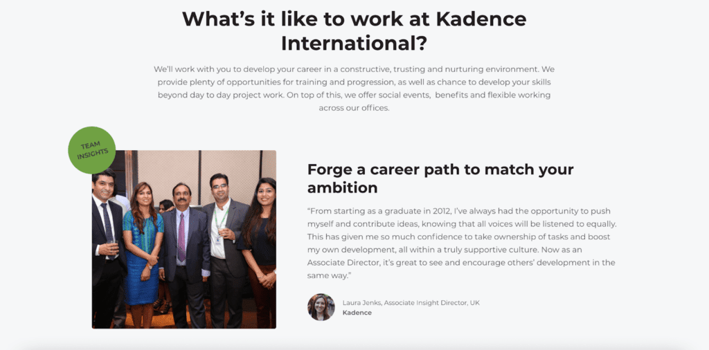
For example, Kadence International has a great section on their careers page that promotes career progression and ambition, with real quotes from their existing team:
Where else is a great home for emotional, humanising content on your website?
The website blogs
Your website blogs, which will often sit within your resource hub, are a vital part of your content marketing engine. As B2B marketers know, keeping the hub up to date with relevant posts full of target keywords means your ideal prospects will find you through search. Not only is the resource hub the perfect home for case studies, news and SEO articles, it’s the perfect home for content that showcases your company for talent acquisition.
Heard of client testimonials? Try employee testimonials. Other ideas include:
- ‘Day in the life’ blogs for different roles at your company from CMO to business development rep
- ‘Meet the team’ interviews that probe at new starters to find out their career goals, challenges and fun stuff like favourite movies and music
- And news that reflects positively on your employee experience, such as new company-wide benefits
Any employees mentioned are likely to share the content on their own social media channels. That’s another strategy to encourage word-of-mouth advocacy about how great your company is to work for!
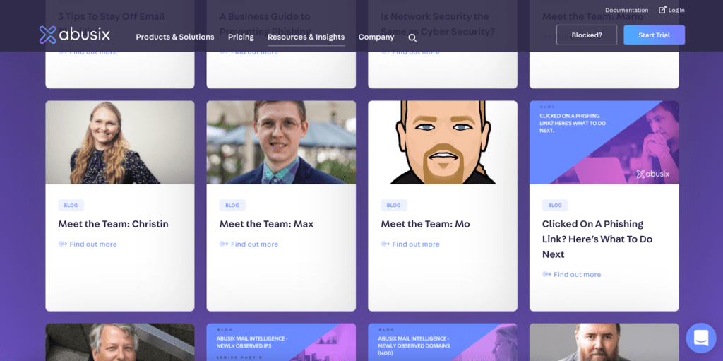
Here’s an example of Abusix, who have an abundance of meet the team interview blogs on their website:
Within your articles should be genuine imagery that shows off employees to humanise your company, foster emotional resonance and reveal a sense of community. You could also use photos of your office spaces, if you’re not fully remote, to give prospects an idea of where they might be working. It’s a fact that genuine images are much better than stock images, which might be outdating your website.
Even better than images are videos, which increase time spent on specific pages to help with SEO ranking, and to provide more emotional resonance so prospects feel connected to your company and the people on camera.
We’ve covered the most obvious pages, but where else on your website might an employee visit to see if they want to work with you?
The ‘about us’ page
The about us page should tell your company’s story. It should tell the viewer why you exist and what you want to achieve as a company. This will help prospective employees believe in your purpose and align their own values with it.
People are no longer looking to work for companies just for a big pay cheque and monetary perks, they want to feel part of something bigger and find personal fulfilment in their career. You can reveal your values in many ways on your about us page, such as through your origin story or a message from the founders themselves.
On the about us page, you’ll also want to showcase your awards, achievements and accolades to prove credibility and build trust. Top talent will want to work for the best of the best and these achievements prove you are just that.
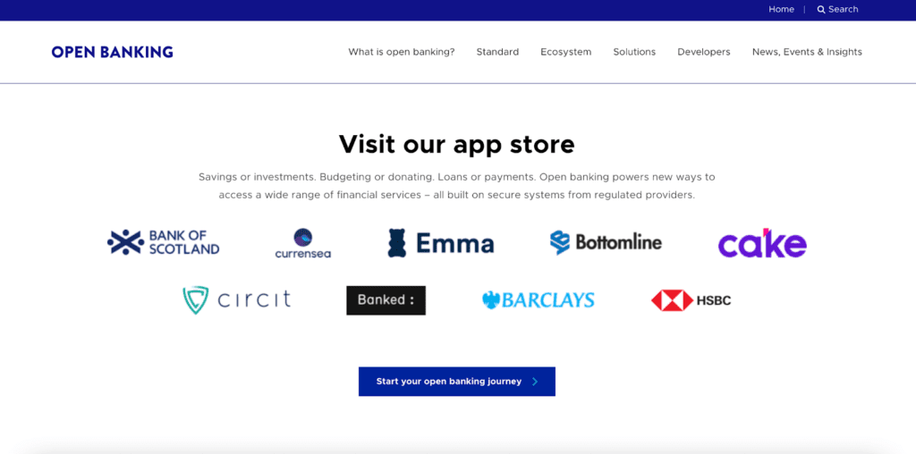
What else proves your success? Notable clients! Slap their logos all over that ‘about us’ page, just like our client Open Banking has done on their new site here:
The home page
The home page is often the first page users will find when they look for your website. This offers an opportunity to shine through a strong and memorable introduction.
Your homepage should represent your company in its entirety, not just what you provide to customers, but why you exist. For example, when the user scrolls down the home page, you could have a ‘work for us’ section that shows you’re always on the lookout for top talent.
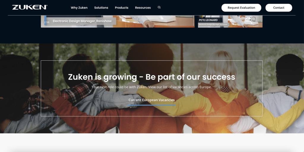
This is the careers section on the homepage of zuken.com. They invite prospective employees to be a part of their success:
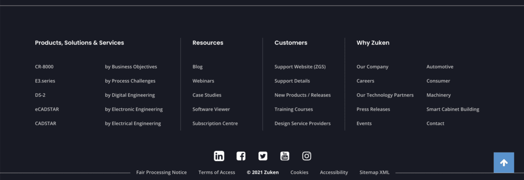
Remember what I said at the beginning. Prospective employees are probably actively looking for your careers page when they land on your site. This means your homepage should be a part of how they get there, by presenting the careers page in an obvious spot. This could be in your menu bar, or in your website footer, like Zuken’s:
73% of job seekers say the process of looking for a job is one of the most stressful events in life! Minimise this stress and make applying an easy decision for top talent, to attract the best of the best in tech.
All examples mentioned were designed and developed by ClarityDX, London’s leading Enterprise WordPress Agency empowering ambitious marketers for success. Get in touch.

Back-seat drivers cause car crash website projects
B2B SEO and the COVID boost
Let's Talk
Do you have a web design and build project coming up that you would like to talk about?