How to align UX, content and design?

A good website is able to ensure the user’s needs are met, making it a user experience that actually delivers against your objectives.
The website is simple and demonstrate clearly to the user what the business is about while allowing the user to easily navigate around the website. The graphical elements such as the layout, typography and interactive elements work together to present a user experience rather than just show the information on the page.
In many cases, the key to achieving this is being able to align UX, content, and design.
This article will assess each element in relation to a website while exploring how they have been affected by the evolving digital landscape. We will then dive into the seven principles of ‘good’ content, and conclude by sharing an outline of how, in practice, you are able to align UX, content, and design.
UX
UX is the abbreviated term used to describe ‘user experience’ design, which refers to any interaction a customer has with a product or service. ‘User experience’ was a term created by Don Norman, a cognitive scientist and co-founder of the Nielsen Norman Group in the late 1990s. He describes it as:
User experience encompasses all aspects of the end-user’s interaction with the company, its services, and its products.
Don Norman, Co-Founder of Nielsen Norman Group
UX is used by design teams to create products/services that meet the exact needs of the appropriate users. They might consider questions like:
- How it will make the user feel?
- How easy it is for the user to complete their desired tasks?
An example of this would be a user learning about a product by going through the checkout process when buying an item online – you want this journey to be efficient and easy for the user to follow. It is important to balance these customer needs with other elements within the process. UX design is a combination of market research, development of the service/product, strategy, and design which by working together, create a high-quality user experience.
True user experience goes far beyond giving customers what they say they want, or providing checklist features.
Nielsen Norman Group
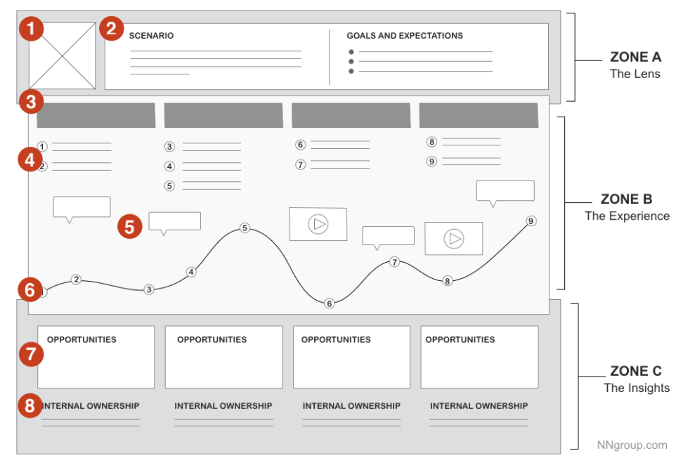
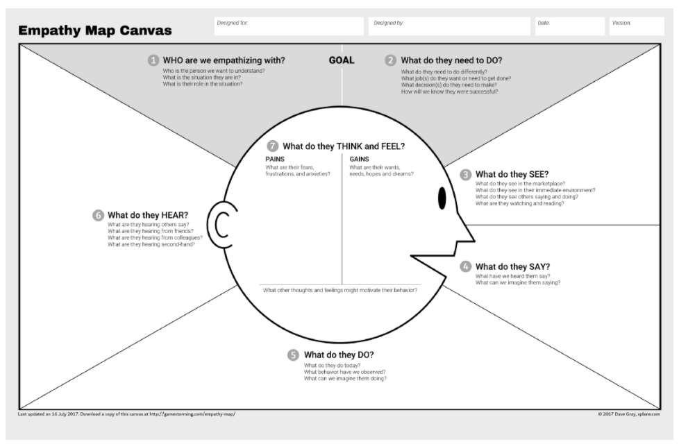
Within user experience design, there are various techniques and methods used to understand the company’s users. For example to better understand your users you may use empathy mapping and user journey mapping. An empathy map canvas can be used to put yourself in the position of the user and really understand their needs before re-designing a website.

User journey mapping is used with the client to create awareness around what the user’s journey is, identifying touch points within a timeline prior to the website, during their visit on the website and what steps follow after this.
This is a great way to look at the overall journey and the relationship that the user will have with the business.

Design
Design is a broad field which covers a variety of different aspects and it’s scope is constantly evolving. Within the web design industry, user interaction (UI) design and UX design goes hand in hand to create a product. However UI design plays a different role to UX design.
UI design is strictly a digital term that is a point of interaction between the user and digital product, i.e. a website. It considers the look and feel of a website design as well as the interactivity. It includes visual elements like the colours, typography, buttons, icons, spacing imagery and how the design will work responsively.
Design is no longer just about the aesthetics of UI elements creating the product or the journey the customer will experience when using the website. The aim is to gain an understanding of what the company is offering, in order to consider what the user’s need, to create a website redesign which will resolve the company’s current issues.
Design is no longer seen as just crafting UI elements or even product experiences. There is a broader understanding in the industry that design can influence the experience a user has with all of a company’s touch points.
Reena Merchant, UX leadership, Google
There has been a shift in the focus of ‘design’. It is no longer about designers creating usable components. Instead we look at how this work can have an impact on the customer experiences and the entirety of a company’s brand.
Content
Content is as equally important as UI and UX design. When writing content it is important to make sure that the writing is inclusive and accessible for the targeted users.
Content can refer to anything from a headline, an image caption, the text of a drop-down menu or what is included in a ‘call to action’. Anything that is included as copy in a website can be classed as content. However, content can also apply to elements on the page that aren’t classed as copy.
For example, an animated gif or where links are placed on the page. Content design can also overlap with UI and UX design, such as making decisions like the size, style and colour of the typeface. It is not just about words on a page, it’s also considering the links, images and format in which the content sits.
When creating content it is important to consider the overall user journey as opposed to just designing content that sits on an individual page. Websites that align content and UX are more likely to rank higher on search engines like Google. This is as a result of SEO favouring original and curated content within the search results.
It has been suggested that there are seven principles of good content design. Put these seven principles into place, and you will be able to articulate your rationale for the content in an easier way, that will help when collaborating with the stakeholders of the business.
Purpose
The purpose needs to be understood before content is produced. You need to have an understanding both at the overall ‘objectives’ level, and a micro level too. It is important to consider the users mindset. For example, how do you want the user to feel when they click on that call to action?
Context
Context sits within the user’s journey. This can be done through user research in order to help you understand the context. This is where content crosses over with user experience design. An action happens before the user sees the content which will be followed by another action. It is important to understand the company’s user journey before creating this content, considering consistency of the brand and messaging.
Accessibility
When producing content it is important to consider something that is functional and usable for everyone. Content should be designed for various reading levels and abilities, including those who may not have English as their first language.
The content being produced can be broken down into shorter sentences and separated with bullets, headers or subheaders in order to keep copy digestible for the user.
However, it doesn’t always have to be in a word format. Instead this could be designed in a form of diagrams or visuals. This is why it is so important to work together with the designer to create a solution to the problem that will be accessible.
Clarity
To ensure clarity across your website and help the user understand what your website is about, you should aim to avoid industry jargon and write in plain english. Although you may be creating content for a B2B website, that doesn’t necessarily mean that the language you use must be formal.
When creating content for call to actions, keeping labels simple and use verbs as opposed to passive language. You should also focus on clear instructional copy which will indicate to the user of what they need to do next.
Brevity
Users take in less than 30% of what they see on screen so it is better to reduce the amount of content. All content should be relevant and if possible it is good to replace copy with visuals. As a general rule, a sentence should be below 25 words to make it easier for the user to read.
Relevance
When you’re creating content, it is vital to consider the target audience and what kind of words and phrases they would be using. When creating content a balance is needed, it should be warm, friendly and conversational yet still providing the correct information to the audience.
Flexibility
As part of UX design, testing is an important element to see whether the prototype created is successful or if improvements can be made. Content may need to be recreated as a result of this or if testing like A/B testing is put in place, then the content should be flexible enough to be shown in different page layouts.
Why should you align UX, content and design?
All of these three elements work together to create a successful website redesign. Without content, UI and UX the design would be incomplete. All three elements combine to produce a successful website that is able to meet your strategic needs, whether that’s an increase in search visibility, or lead conversion.
There is no arguing about the importance of aesthetics and no one can undermine the work of UX designers. However, if you bring the site to the perfection, you’ll still need engaging content in order to bring back the user.
UX Planet
If these three elements are not aligned there can be complications in the redesign process. If content is missing it creates issues with the design aspect for both UI and UX.
When working on a web design project, there is this continuing debate as to whether content or design should come first. It is argued that from a practical point of view that content should come first. Putting content first speeds up the production of a project. When a content designer is introduced to a project in the later stages, it can be seen as more time consuming for the content designer to get up to speed on the research of the project.
When content designers are brought in too late to a project there is often a lot of groundwork to do in order to catch up on what’s already been discovered.
Rachel McConnell, UX Leadership, Google
What happens when one of the three elements is missing?
Copy often goes through many rounds of amends, accounting for inputs from various stakeholders. By putting copy first, it ensures that content is ready as quickly as possible so it does not slow down the design phase of the project. Even if a first draft of content has been produced, this will most likely go through at least a round of amends which will have an impact on the designs as it will require the designer to update designs and so on. In an ideal situation, although not always feasible, producing content that has already been signed off before entering the design phase will help speed up the process in the long run.
Without content, it is harder to predict a design layout which will work in conjunction with the content. Placeholder text can be used for this and recommendations can be put in place for what content should be included but more often than not copy is provided which does not necessarily fit with the designs which have appropriately considered the user’s needs.
Without UX, there is no justification for the design phase of a project. User experience design is crucial to understand the businesses needs and goals as well as the user’s needs. By carrying out user research, we create a meaningful user experience that defines the customer journey throughout the website. Content design also goes hand in hand with user experience design as this also helps to identify the user group for the project and tailor content specifically to that target audience.
Practical approach to aligning UX, content and design
It is not always feasible for clients to produce content straight away however it is good to initiate conversations in the early stages of discovery to ensure this is considered.
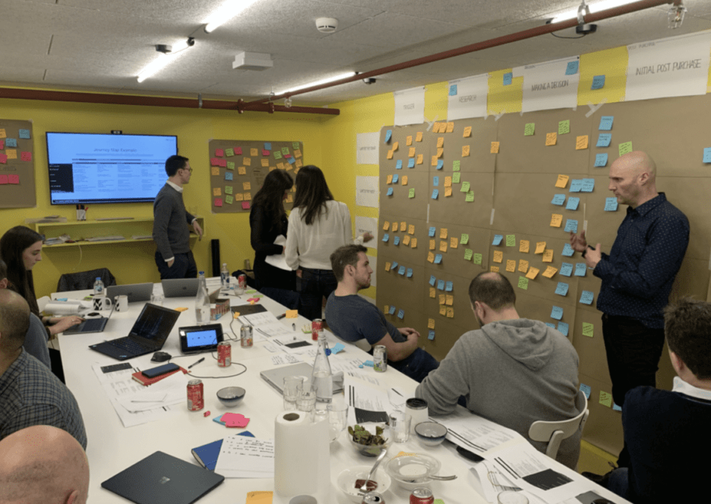
Workshops are a good way to ensure UX, content and UI design are aligned. Workshops allow the agency, and clients to work together as a team and establish the needs of their business and their users.

It is crucial to understand the user’s prior to the UX & design phase of a project. Doing so helps to establish a successful user experience combined with appropriate content that the user will understand while reflecting company’s brand and values.
Who should be involved?
To ensure you are able to have a cohesive approach to UX, content & design alignment, you should involve some, or all of:
- Designers with expertise in UI and UX design
- Copywriters
- Content designer
- Project managers
- Developers
- The client!
What are the timelines?
Timelines vary from project to project, there isn’t just one set timeline. But as a general rule, the discovery phase comes first which can cover UX design as well as content before going into the design phase where the research produced in the discovery phase is implemented into the UI designs.
User research and content planning is undertaken within the discovery phase, this can include techniques such as empathy mapping, user interviews, content mapping before starting on the wireframes. Following on from this, the project will then enter the design phase where the UI designs will be created for the user. These designs will be created based on the user research and the discovery deliverables that would have already been presented to the client.
How do you know when you’ve done a good job of aligning UX, content and design?
When the three have been aligned successfully, you will have a website that has met the user’s needs, making it a user experience that actually delivers against the results of your project.
The website will be simple and demonstrate clearly to the user what the business is about while easily navigating around the website. The graphical elements such as the layout, typography and interactive elements work together to present this user experience rather than just present the information on the page.
Websites contain more visual and interactive cues to present information to ensure the user isn’t overwhelmed by the amount of content on the page and encourage more emotional responses to help the business stand out from their competitors.
Keen to find out more about our design process? Check out more blog posts from Fenella and the rest of the design team on how to plan user journeys into your website redesign process, or why less is more when it comes to a website design.

How can artificial intelligence and machine learning impact B2B lead generation?

Internal day: September 2020
Let's Talk
Do you have a web design and build project coming up that you would like to talk about?